Pular para o conteúdo
Pular para o conteúdo principal

Familiar Pro™

por CheapProFonts
Estilos Individuais a partir de $0.00 USD
Família completa com 8 fontes: $50.00 USD
A família de fontes Familiar Pro foi desenhada por Roger S. Nelsson e publicada pela CheapProFonts. Familiar Pro contém 16 estilos e opções de pacote familiar.

Saiba mais sobre esta família

Sobre a família


This family was inspired by a Type Battle over at Typophile: How would you design a font metrically compatible with Helvetica, but better than Arial? Working with preset letter widths was an interesting constraint, both a relief and a limitation at the same time. I have done all the 4 basic weights, and the skewed obliques (done to a slightly less steep 10 degrees angle as opposed to the originals 12) has been optically adjusted. The letters have been designed quite close to the german/swiss grotesk tradition, but by using super-elliptical rounds, rounded dots and slightly curved outer diagonals the end result is a friendly looking font family that still looks... familiar. ALL fonts from CheapProFonts have very extensive language support: They contain some unusual diacritic letters (some of which are contained in the Latin Extended-B Unicode block) supporting: Cornish, Filipino (Tagalog), Guarani, Luxembourgian, Malagasy, Romanian, Ulithian and Welsh. They also contain all glyphs in the Latin Extended-A Unicode block (which among others cover the Central European and Baltic areas) supporting: Afrikaans, Belarusian (Lacinka), Bosnian, Catalan, Chichewa, Croatian, Czech, Dutch, Esperanto, Greenlandic, Hungarian, Kashubian, Kurdish (Kurmanji), Latvian, Lithuanian, Maltese, Maori, Polish, Saami (Inari), Saami (North), Serbian (latin), Slovak(ian), Slovene, Sorbian (Lower), Sorbian (Upper), Turkish and Turkmen. And they of course contain all the usual "western" glyphs supporting: Albanian, Basque, Breton, Chamorro, Danish, Estonian, Faroese, Finnish, French, Frisian, Galican, German, Icelandic, Indonesian, Irish (Gaelic), Italian, Northern Sotho, Norwegian, Occitan, Portuguese, Rhaeto-Romance, Sami (Lule), Sami (South), Scots (Gaelic), Spanish, Swedish, Tswana, Walloon and Yapese.

Designers: Roger S. Nelsson

Publicador: CheapProFonts

Fundidoras: CheapProFonts

Proprietário do design: CheapProFonts

Estreia na MyFonts: May 26, 2011

Familiar Pro™ is a trademark of CheapProFonts.

Sobre CheapProFonts

High quality multilingual fonts at a low price - for professional (non-english) designers with a small budget! 
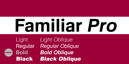
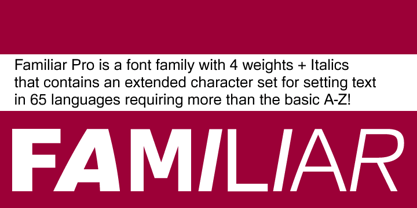
CheapProFonts offers a wide selection of mainly display-fonts with a large character set supporting 65 languages requiring more that the basic A-Z: Afrikaans, Albanian, Basque, Belarusian (Lacinka), Bosnian, Breton, Catalan, Chamorro, Chichewa, Cornish, Croatian, Czech, Danish, Dutch, English ;), Esperanto, Estonian, Faroese, Finnish, French, Frisian, Galican, German, Greenlandic, Guarani, Hungarian, Icelandic, Indonesian, Irish (Gaelic), Italian, Kashubian, Kurdish (Kurmanji), Latvian, Lithuanian, Luxembourgian, Malagasy, Maltese, Maori, Northern Sotho, Norwegian, Occitan, Polish, Portuguese, Rhaeto-Romance, Romanian, Saami (Inari), Saami (Lule), Saami (North), Saami (South), Scots (Gaelic), Serbian (latin), Slovak(ian), Slovene, Sorbian (Lower), Sorbian (Upper), Spanish, Swedish, Tagalog (Filipino), Tswana, Turkish, Turkmen, Ulithian, Walloon, Welsh and Yapese. What I have done is to team up with several well-known freefont designers, and use their fonts as a starting point to make updated professional quality multilingual Unicode fonts - and then offer them at a very low price and with very generous licensing terms. All the reworking is done under agreement with the original designers, and they receive royalties from the sales. It is a bit more work making these fonts than first meets the eye - I do not simply make some generic diacritics, slap them together with the existing letters and generate the fonts. That would be sloppy ;) First I check the outlines of the existing letters, fixing any bad nodes, often normalizing the spacing and adjusting some glyphs. Then I take a close look at the kerning, improving it where necessary and preparing it for OpenType class kerning. Only when the basic font is OK do I start expanding the character set, always using diacritics that matches the design of the letters - usually all diacritics are totally redesigned. Finally I generate and test the fonts, make graphics and text for their presentation and prepare the files for download. I hope many "foreign language" users find CheapProFonts a valuable resource for cheap and cheerful display fonts supporting their specific language needs.

Ler mais

Ler menos