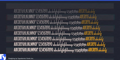
Luxury typography often has to fit into awkwardly narrow spaces. A restaurant name has to sit above a menu column; a fragrance name has to fit a tall bottle; two long surnames have to share an invitation without shrinking into insignificance. A conventional condensed sans can solve the width problem but leave the result feeling mechanical. Fledgling takes another approach: narrow proportions, a very low x-height and long ascenders make words feel elongated rather than squeezed.
That unusual proportion gives Fledgling a particularly elegant mixed-case silhouette. The lowercase stays small while ascenders rise dramatically above it, creating strong vertical movement without consuming much horizontal space. Hairline and Thin can become exceptionally delicate; heavier styles add presence without losing the same tall, narrow structure.
Fine dining and intimate hospitality make especially good use of those proportions. Hotel restaurants, wine bars, champagne bars, cocktail lounges and afternoon-tea venues need typography for restaurant names, tasting-menu sections, chef names, wine headings and private-dining events. Fledgling can keep long names prominent in narrow menu layouts while leaving room for photography, prices and supporting text. A quieter companion face can handle descriptions and small print while Fledgling provides the distinctive display hierarchy.
The same qualities work well inside hotels and resorts. Spa treatment names, suite names, boutique identities, restaurant graphics and afternoon-tea cards often need refinement without the spectacle of a large resort logo. Fledgling feels more intimate: the name on the treatment menu, the lettering on the restaurant window or the suite title printed on a card waiting in the room.
Fragrance and beauty products give its narrowness a physical purpose. Tall perfume bottles, skincare cartons, salon products and beauty gift sets frequently offer very little horizontal room for a product or collection name. Fledgling can remain large and graceful within those spaces, particularly in the lighter weights. Haircare collections and salon identities can carry the same elongated typography from bottles and boxes into campaign headings and window graphics.
Fashion benefits from the same vertical proportions. Designer names, collection titles, millinery labels, eyewear brands and accessory lines can use Fledgling in lookbooks, garment tags, invitations and boutique windows. Its low lowercase and long ascenders create an elegant, slightly unusual rhythm without relying on decorative flourishes or conventional high-fashion Didones.
Formal events provide another useful setting. Wedding invitations, reception menus, ceremony programs and venue cards often have long names competing for limited width. Fledgling gives those names height and presence without forcing them into all caps or compressing them until they feel utilitarian.
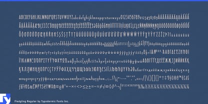
Fledgling spans eight weights with matching italics, allowing the same narrow construction to move from extremely fine display lettering to considerably stronger headlines. Its small x-height makes it a display family rather than a choice for tiny print or sustained reading; names, headings and short prominent lines give those unusual proportions enough room to work.
Fledgling is for typography that needs to be narrow without looking compressed. A restaurant name, perfume bottle, fashion label or wedding card can occupy remarkably little width while still looking tall, deliberate and elegant.