



Pular para o conteúdo
Pular para o conteúdo principal

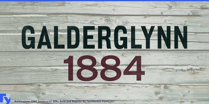
Galderglynn 1884™

por Typodermic
Estilos Individuais a partir de $69.95 USD
Família completa com 25 fontes: $169.95 USD
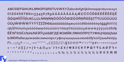
A família de fontes Galderglynn 1884 foi desenhada por Ray Larabie e publicada pela Typodermic. Galderglynn 1884 contém 25 estilos e opções de pacote familiar. Saiba mais sobre esta família

Sobre a família


Recreating one nineteenth-century headline is easy. Building an entire nineteenth-century visual system is where the trouble starts. The period offers countless distinctive grotesques, condensed faces, engraved styles and shadowed display letters, but they were rarely designed to cooperate as one family. A modern identity that needs all of those voices can quickly become a scavenger hunt through unrelated typefaces. Galderglynn 1884 was built to solve that problem.

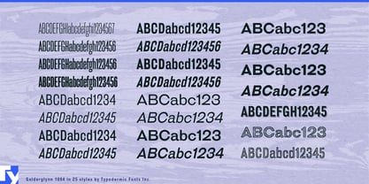
The family grew from a commission for Jameson Irish Whiskey. The agency had seen Galderglynn Esquire, with its deliberately mismatched nineteenth-century grotesque forms, but needed something more controlled and far more extensive. Galderglynn 1884 developed that vocabulary into a coordinated 25-style system, including regular and condensed families with italics, four extremely narrow Squeeze weights, plus engraved and shadow treatments.

That range is especially useful for beverage identities and other heritage products that have to work across many objects. A distillery may need a broad bottle name, a narrow age statement, batch information on a side panel, neck labels, cartons, tasting-room menus, barrel graphics and visitor-centre signs. Galderglynn 1884 can change width, weight and treatment while keeping those elements recognizably related instead of assembling the identity from unrelated Victorian display faces.

Its compressed styles preserve a construction that has become less common in contemporary sans-serif families. Rather than merely squeezing ordinary proportions narrower, the Condensed and Squeeze designs become increasingly flat-sided, recalling nineteenth-century newspaper and poster grotesques. The narrowest styles are especially useful for bottle necks, book spines, tall signs, narrow packaging panels, ticket graphics and long names forced into vertical spaces.

Historical exhibitions face the same system problem at a different scale. Railway museums, industrial-history displays and exhibitions about nineteenth-century cities may need large section headings, compressed timeline titles, maps, artifact labels and decorative panels that all belong to the same period. Film, television and game production can draw on the family for coordinated newspaper headlines, railway placards, shop signs, hotel notices and advertising props.

Publishing and historic hospitality offer similar opportunities. Historical nonfiction, biographies and industrial histories can use Galderglynn 1884 for jackets, series identities, chapter openings and timelines, while historic pubs, restored railway hotels and old-market restaurants can carry the same visual language across menus, room numbers, signs and event graphics.

Galderglynn Esquire began with the idea of a type drawer filled with mismatched nineteenth-century grotesques. Galderglynn 1884 is what happens when somebody organizes the drawer and makes sure every useful width and treatment is actually there.

Designers: Ray Larabie

Fundição: Typodermic

Estreia na MyFonts: Jan 19, 2019

Galderglynn 1884™ is a trademark of Typodermic.

Sobre Typodermic

Welcome to Typodermic Fonts, a spirited type foundry rooted in Nagoya, Japan, started by the Canadian typeface designer, Raymond Larabie in 2001. Our library brims with 500+ diverse typefaces to fuel creativity in graphic design, advertising, web, and app development. As digital type pioneers, we adopted web fonts and app licensing early, consistently pushing the design envelope. With Canadian heart and Japanese precision, we're your global partners in extraordinary typography. Explore Typodermic Fonts—where creativity meets character.

Ler mais

Ler menos
