


Pular para o conteúdo
Pular para o conteúdo principal

Globet Round

por deFharo
Estilos Individuais a partir de $12.00 USD
Família completa com 4 fontes: $36.00 USD
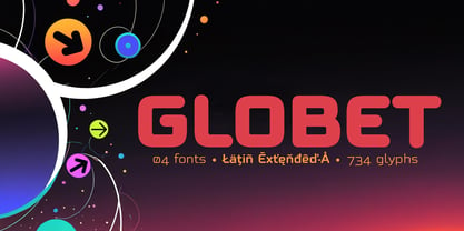
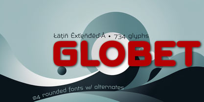
A família de fontes Globet Round foi desenhada por Fernando Haro e publicada pela deFharo. Globet Round contém 4 estilos e opções de pacote familiar. Saiba mais sobre esta família

Sobre a família


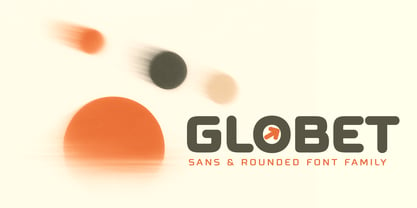
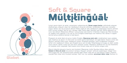
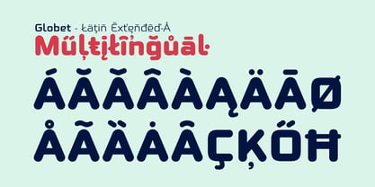
Globet Rounded is a multipurpose conceptual font that perfectly combines boldness with elegance, Globet was born from the desire to balance legibility and personality. Gentle geometry and optical precision come together to create an exceptional reading experience.

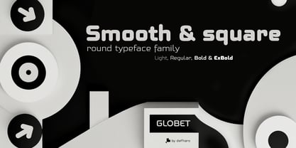
Its square proportions provide a solid foundation, while its rounded shapes soften the geometric structure, giving it a friendly, approachable, and modern tone. Rounded typefaces have that unique magic: they communicate with warmth without losing strength; they are versatile, friendly, and highly professional, ideal for brands that want to connect without appearing cold or distant.

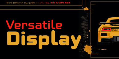
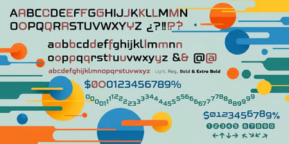
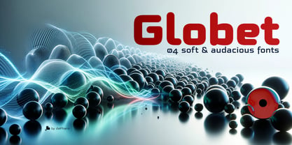
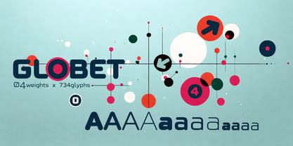
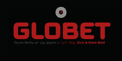
Four weights, endless possibilities. Globet Rounded comes in four carefully balanced versions: Light, Regular, Bold, and Extra Bold. You can use it for everything from light and airy body text to striking headlines that demand a strong presence.

Globet is not only beautiful, it's also smart. Globet includes advanced OpenType features: (Compatible with InDesign, QuarkXpress, Photoshop, and Illustrator)

Designers: Fernando Haro

Fundição: deFharo

Estreia na MyFonts: Sep 8, 2025

Globet Round

Sobre deFharo

deFharo is the independent type foundry of Spanish graphic and type designer Fernando Haro. With more than 30 years of experience in graphic and advertising design and over a decade devoted to typeface design, Fernando Haro has developed an eclectic body of work that ranges from editorial and corporate typefaces to expressive display, geometric, technological, retro and experimental designs. His approach combines visual character with typographic functionality. Every typeface begins with drawing, proportion and a clear visual idea, and evolves through meticulous work on spacing, metrics, kerning, optical corrections and OpenType features. Rather than following a single recognizable style, deFharo explores different typographic territories according to the personality and purpose of each project. Some families are designed for long-form reading and editorial systems; others are built for branding, headlines, packaging, signage or highly expressive graphic compositions. A strong interest in vector drawing, typographic systems and functional design runs throughout the collection. Alternative characters, small caps, Petite Caps, fractions, numerals, ligatures, symbols and extended language support are frequently developed as integral parts of the typeface rather than as afterthoughts. The result is a growing collection of typefaces designed to be both distinctive and useful — fonts with personality, but also with the technical precision required for professional graphic and editorial work. deFharo typefaces are designed by Fernando Haro and published independently from Spain.

Ler mais

Ler menos