Imperio™

por Juan I. Siwak
Estilos Individuais a partir de $40.00 USD
30% Off
A família de fontes Imperio foi desenhada por Juan Ignacio Siwak e publicada pela Juan I. Siwak. Imperio contém 8 estilos.

Saiba mais sobre esta família

Sobre a família


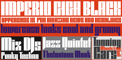
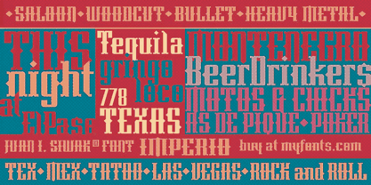
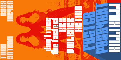
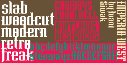
Imperio is a font inspired by old posters, especially those related to constructivism and futurism. It reflects both the rationalism of Bauhaus as a propagandist and revolutionary spirit of an era. On the other hand it is not nostalgic, but instead looks for its own way to get diagonals where there was rigidity. The poster itself is the language of graphic design, and geometry is its ally. This font aims for that goal. It has two variants that derive from its source. Imperio Giga Black attempts to be a negative typography, starting with the black and then searching for small windows in which they begin to uncover the morph. This is an extreme and modern font. Imperio West is a metamorphosis of the original one, with decorative details which transform it into a typeface of wood and saloon font. In all cases we recommend its use in large sizes (up to 20pt) and main titles. Imperio UltraBlack can work in smaller sizes than Imperio Regular.

Designers: Juan Ignacio Siwak

Publicador: Juan I. Siwak

Fundidoras: Juan I. Siwak

Proprietário do design: Juan I. Siwak

Estreia na MyFonts: Jun 10, 2009

Imperio™ is a trademark of Juan Ignacio Siwak.

Sobre Juan I. Siwak

Juan Ignacio Siwak is a graphic designer, and started working before he finished (never completed) his studies. He has a comprehensive and eclectic formation in music, philosophy, psychology and graphic design. His interest in typography love comes from his childhood with his father, who is a journalist, and from the covers of rock albums. Since getting some awards in this field, he decided to complete some of his work and start new ones. He works independently as a designer and specializes in editorial design, identity, and also in computer graphics and medical illustrations.

Ler mais

Ler menos