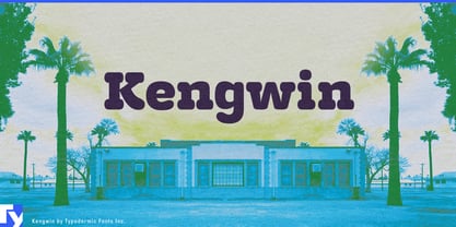
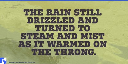
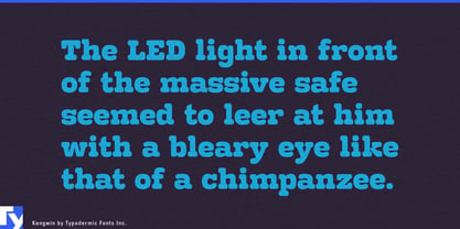
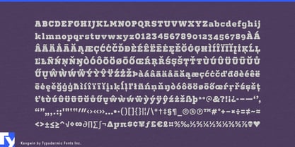
Brands aimed at mixed-age audiences often face an awkward typographic choice. Push too far toward bubbly, cartoonish lettering and adults feel like they have wandered into a children’s attraction; clean the identity up too much and the sense of fun disappears. Kengwin occupies the useful space between those extremes, combining broad, substantial letterforms with rounded slab serifs that soften the message without making it juvenile.
That balance makes it especially useful for entertainment venues designed for children, teenagers and adults at the same time. Indoor mini-golf centers, bowling complexes, interactive game venues and mixed recreation spaces need typography for attraction names, party rooms, prize counters, food areas, leagues and seasonal events. Kengwin can make those spaces feel recreational while remaining substantial enough for adult groups, corporate events and evening programs.
Family resorts face a similar problem. Indoor-waterpark hotels, ski resorts, holiday parks and destination properties often contain children’s activities, restaurants, rental counters, game rooms and evening entertainment alongside conventional hotel spaces. Kengwin can identify activity zones, family dining, equipment rental and seasonal programs without forcing the entire property into kiddie graphics.
Functional foods create another useful tension. High-protein frozen desserts, protein cookie dough, fortified brownie bites and other products increasingly combine nutritional claims with formats that are still supposed to look like treats. Clinical wellness typography can make the food feel medicinal; exaggerated confectionery lettering can undermine the functional side of the product. Kengwin has enough structure to support a serious product claim while its rounded forms keep the package appetizing.
Premium pet wellness products encounter much the same challenge. Dental chews, joint-support treats, senior-pet nutrition, freeze-dried rewards and daily supplement chews are purchased by adults making considered health decisions, but they still need warmth and approachability on the shelf. Kengwin can handle product names and benefit categories without drifting toward cartoon imagery or veterinary austerity.
Middle-grade science and learning products provide another natural setting. Home chemistry kits, geology sets, beginner robotics, astronomy activities and mechanical building kits need to look inviting to older children without appearing preschool-oriented. Kengwin’s rounded details make kit names and experiment headings approachable, while its conventional underlying proportions keep the material from feeling simplified or babyish.