


Pular para o conteúdo
Pular para o conteúdo principal

Kinesthesia

por Typodermic
Estilos Individuais a partir de $69.95 USD
Família completa com 14 fontes: $169.95 USD
A família de fontes Kinesthesia foi desenhada por Ray Larabie e publicada pela Typodermic. Kinesthesia contém 14 estilos e opções de pacote familiar. Saiba mais sobre esta família

Sobre a família


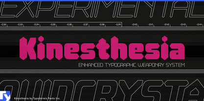
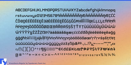
Precision equipment has to communicate control and accuracy without disappearing into generic industrial typography. Kinesthesia gives that world a more distinctive display language. Its angular construction and diamond-shaped stroke endings suggest both electronically segmented readouts and surfaces cut by a precision tool; the result feels measured and machined at the same time.

Metrology equipment is a natural fit. Digital calipers, laser measuring systems, torque instruments, machine probes and dimensional-inspection hardware can use Kinesthesia for instrument names, product families, model designations and trade-show graphics, while a quieter companion face handles measurements, instructions and calibration data.

Precision machining extends the same visual logic into CNC tooling, carbide inserts, end mills, tool holders and cutting systems. Series names and catalogue headings can sit comfortably beside beveled metal, machined edges and tightly controlled geometry without relying on the usual aggressively industrial lettering.

Performance measurement provides a more dynamic branch. Cycling power meters, race-timing equipment, lap timers, telemetry systems and sports-testing hardware can use the upright styles for equipment families and the italics for model variants, performance graphics and race-oriented campaigns. Machined wheels, bicycle components and other precision-finished parts offer a related product application.

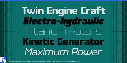
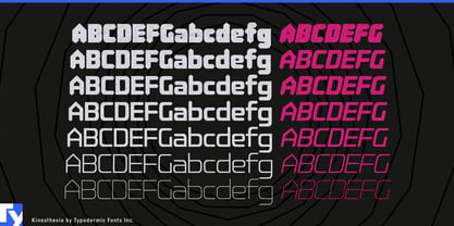
Seven weights with matching italics give Kinesthesia enough range to build a complete display hierarchy rather than a single dramatic headline. It is a family for things that measure, cut, test and quantify; metrology instruments, machining tools, timing systems and precision components all give its diamond-ended geometry a physical reason to exist.

Designers: Ray Larabie

Fundição: Typodermic

Estreia na MyFonts: Aug 14, 2022

Kinesthesia

Sobre Typodermic

Welcome to Typodermic Fonts, a spirited type foundry rooted in Nagoya, Japan, started by the Canadian typeface designer, Raymond Larabie in 2001. Our library brims with 500+ diverse typefaces to fuel creativity in graphic design, advertising, web, and app development. As digital type pioneers, we adopted web fonts and app licensing early, consistently pushing the design envelope. With Canadian heart and Japanese precision, we're your global partners in extraordinary typography. Explore Typodermic Fonts—where creativity meets character.

Ler mais

Ler menos
