Pular para o conteúdo
Pular para o conteúdo principal

Lumen Grotesk

por Glyphline
Estilos Individuais a partir de $39.00 USD
Família completa com 5 fontes: $89.00 USD
A família de fontes Lumen Grotesk foi desenhada por Catherine Bellot e publicada pela Glyphline. Lumen Grotesk contém 5 estilos e opções de pacote familiar. Saiba mais sobre esta família

Sobre a família


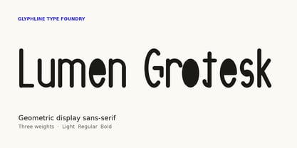
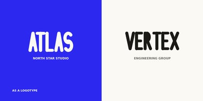
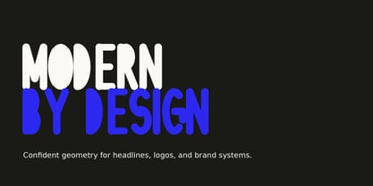
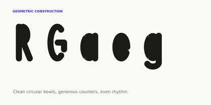
Lumen Grotesk is a geometric display sans-serif built for brands that want to feel modern, clear, and confident. Circular bowls, open counters, and an even rhythm give headlines a clean, contemporary presence, while the letterforms stay simple enough to work hard in logos, packaging, and full brand systems.

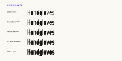
The family ships in five weights — Light, Regular, Medium, SemiBold, and Bold — a practical range that covers everything from delicate subheads to high-impact display lines. Lumen Grotesk performs best at large sizes, where its geometric structure and generous spacing come through most clearly: logotypes, posters, titles, editorial headlines, and product or app branding.

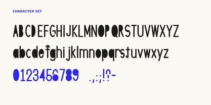
Uppercase, lowercase, figures, accented Western and Central European characters, and full punctuation are included in every weight. Pair Lumen Grotesk with a neutral text face for body copy and let it carry the voice up top.

Designed by Catherine Bellot and released by Glyphline, an independent display-type foundry.

Designers: Catherine Bellot

Fundição: Glyphline

Estreia na MyFonts: Jul 22, 2026

Lumen Grotesk

Sobre Glyphline

Glyphline is an independent display-type foundry dedicated to original typefaces with genuine character. We believe display type is where a brand finds its voice — the first thing an audience feels before they read a single word — and we design with that responsibility in mind. Every Glyphline typeface is drawn in-house and built to perform at scale, from logotypes and packaging to editorial headlines and signage. Our work spans a deliberate range of expressions — geometric and rounded sans, high-contrast serifs, and condensed, extended, and stencil forms — so designers can find a distinct, confident voice for any project rather than settling for the familiar. What drives the foundry is craft and restraint: letterforms that are bold without being loud, expressive without sacrificing legibility, and consistent across weights so a single family can carry an entire identity. We care about proportion, rhythm, and the small decisions that make type feel intentional. Glyphline exists for the designers, studios, and brands who want type with personality — and the engineering to back it up.

Ler mais

Ler menos