Esta é uma listagem de todos os glifos contidos na fonte, incluindo variantes OpenType que podem estar acessíveis apenas em aplicativos compatíveis com OpenType.
Cada caractere básico ('A') é seguido por variantes Unicode do mesmo caractere (Á, Ä...), depois variantes OpenType (versaletes, alternativas, ligaduras...). Dessa forma, você pode ver todas as variações de um único caractere em um só lugar.
Selecione o estilo para exibir as especificações técnicas
:
151363516
151363517
167350318
151363518
151363519
151363522
151363523
151363524
151363525
151363526
151363527
151363534
151363535
151363538
151363539
151363540
151363541
151363542
151363543
151363544
151363545
151363546
151363547
151363548
151363549
151363552
151363553
151363550
151363551
151363528
151363529
151363530
151363531
151363532
151363533
151363520
151363521
151363554
151363555
151363536
151363537
167350319
Opções de licenciamento
As licenças da MyFonts são voltadas para criativos individuais, mas nem todas atendem a usos mais amplos ou complexos, por isso recomendamos a leitura completa da EULA. Se você precisa de uma licença para agência, empresa ou para um uso não listado abaixo, ou se tiver dúvidas, fale com a gente e ajudaremos a encontrar a opção ideal para você.
As seguintes licenças estão disponíveis para esta fonte:
Desktop: para criação de designs
Esta licença básica permite o uso em trabalhos pessoais e comerciais de design gráfico tradicional.
A Licença Desktop permite que você crie, imprima e compartilhe designs estáticos e não editáveis, como:
Identidade da marca
Use as fontes para criar uma identidade de marca forte e consistente.
Vídeos
Use fontes em títulos, créditos e textos na tela.
PDFs
Formate relatórios, panfletos e documentos digitais.
Cartões comemorativos
Crie cartões exclusivos e personalizados para qualquer ocasião.
Logotipos
Crie tipografias de logotipos marcantes e profissionais.
Sinalização (Placas e outdoors)
Crie sinalizações claras e de impacto para ambientes internos e externos.
Flyers
Crie flyers chamativos com títulos de impacto.
Embalagens
Valorize embalagens de produtos com textos estilizados.
Capas de álbuns
Crie artes de capa originais para álbuns.
Pôsteres
Crie uma arte marcante e chamativa.
Convites
Produza convites personalizados e sofisticados para eventos.
Posts para redes sociais
Faça designs artísticos e legendas com fontes diferenciadas.
Cartões de visita
Tenha cartões profissionais e memoráveis.
Trabalhos escolares
Destaque seus projetos com textos criativos.
Estampas
Aplique designs de texto em camisetas, moletons e muito mais.
Papelaria
Desenvolva papéis timbrados e envelopes elegantes.
As fontes não podem ser hospedadas em DAMs como ativos para download.
mostrar tudo
As licenças para desktop são baseadas no número de usuários da fonte, ou seja, o número de computadores nos quais a fonte será instalada. É possível alterar o número de usuários clicando na opção de quantidade no menu suspenso das páginas de opções de compra ou carrinho.
Confira o
contrato de licença Desktop
da fundição, pois certas restrições podem ser aplicadas – como uso em logotipos/marcas, restrições geográficas (quantidade de locais) e produtos destinados à venda.
Adicionando usuários posteriormente:
As licenças Desktop são cumulativas. Se for necessário cobrir mais usuários, basta fazer um novo pedido do mesmo pacote Desktop, para o número adicional de usuários desejado.
Webfonts permitem incorporar a fonte em uma página web usando a regra @font-face, assim parágrafos e títulos podem ser estilizados com a webfont. Você irá hospedar o kit da webfont em seu próprio site e vinculá-lo no CSS.
Webfonts podem ser usadas em um único domínio. Agências responsáveis por vários sites, como agências de web design ou provedores de hospedagem, não podem compartilhar uma única licença de webfont entre múltiplos sites.
Se o arquivo da fonte não for incorporado ao site (por exemplo, quando a fonte é usada em uma imagem gráfica estática como um logotipo), você deve adquirir uma licença desktop.
A maioria das fundidoras na MyFonts oferece suas webfonts com o modelo de licença anual. Clique aqui para
saber mais.
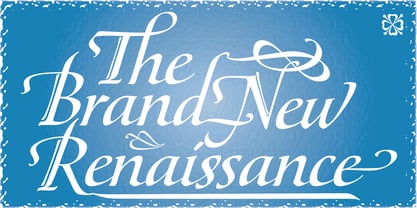
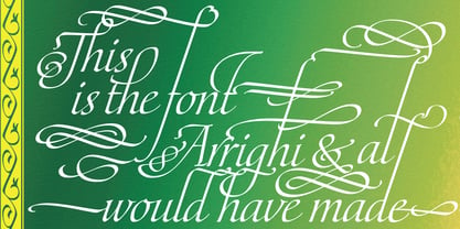
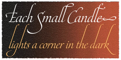
Out of a lifelong inner struggle, Philip Bouwsma unleashes a masterpiece that reconciles classic calligraphy with type in a way never before attempted.
Maestro takes its cue from the Italian chancery cursive of the early sixteenth century. By this time type ruled the publishing world, but official court documents were still presented in calligraphy, in a new formal style of the high Renaissance that was integrated with Roman letters and matched the refined order of type. The copybooks of Arrighi and others, printed from engraved wood blocks, spread the Italian cancellaresca across Europe, but the medium was too clumsy and the size too small to show what was really happening in the stroke. Arrighi and others also made metal fonts that pushed type in the direction of calligraphy, but again the medium did not support the superb artistry of these masters or sustain the vitality in their work. As the elegant sensitive moving stroke of the broad pen was reduced to a static outline, the human quality, the variety and the excitement of a living act were lost. Because the high level of skill could not be reproduced, the broad pen was largely replaced by the pointed tool. The modern italic handwriting revival is based on a simplified model and does not approach the level of this formal calligraphy with its relationship to the Roman forms.
Maestro is the font that Arrighi and his colleagues would have made if they had had digital technology. Like the calligraphic system of the papal chancery on which it is modelled, it was not drawn as a single finished alphabet, but evolved from a confluence of script and Roman; the script is formalized by the Roman to stand proudly in a world of type. Maestro came together on screen over the course of several years, through many versions ranging widely in style, formality, width, slant, weight and other parameters. On one end of the spectrum, looking back to tradition it embodies the formal harmony of the Roman capitals and the minuscule which became the lower case. On the other it is a flowing script letter drawing on the spirit of later pointed pen and engravers scripts. As its original designers intended, it works with simple Roman capitals and serifs or swash capitals and baroque flourishes. The broad pen supplies weight and substance to the stroke which carries energy through tension in balanced s-curves. Above all it is meant to convey the life and motion of formal calligraphy as a worthy counterbalance to the stolid gravity of metal type.
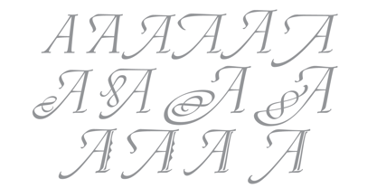
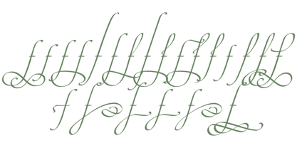
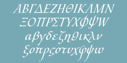
The Maestro family consists of forty fonts distributed over two weights. The OpenType version compresses the family considerably down to two fonts, regular and bold, each containing the entire character set of twenty fonts, for a total of more than 3350 characters per font. These include a wide variety of stylistic alternates, ligatures, beginning and ending letters, flourishes, borders, rules, and other extras. The Pro version also includes extended linguistic support for Latin-based scripts (Western, Central and Eastern European, Baltic, Turkish, Welsh/Celtic, Maltese) as well as Greek.
For more thoughts on Maestro, its background and character sets, please read the PDF accompanying the family.
Canada Type is an independent digital lettering and font development studio based in Toronto. We were founded in 2004 by a couple of experienced designers who were not pleased with the quality and licensing terms of fonts around the turn of the century. Since then we have greatly expanded, built a versatile and popular retail catalogue, and helped many designers bring international attention to their talents in the constantly changing and increasingly competitive world of type design.While Canada Type offers a varied library of fonts, our bread and butter are really the bespoke services we’ve been providing to companies across many fields on local, national and global levels. Over the past 20 years, we have developed custom fonts for companies in a variety of sectors, ranging from the marketing, financial and service industries to major film studios, big software corporations, and telecom/broadcast outfits.This is what we love to do, and we’re fortunate to do it on a daily basis. If you consider well-crafted typography essential to your brand’s visual communication, we’re here to help, so please reach out. The promise you get from us is one of care, quality and highly informed, satisfying results.https://canadatype.com