MMC INSIGNIA is an Iconic & Emblematic Extremely Geometric Small Caps Display Typeface! It provides samples repetition or a pattern of this “Hourglass” Symbol throughout the typeface unraveled by a grid work, only with diagonals and perpendiculars to the square, like solving puzzles!
This unique Icon or Graphic Sign, of two counterpoint triangles sampled through the whole Characters, which can be implicit as hourglasses, is a potential trend that has already been used firstly in a few different Logos, plus it alludes also to a famous International Bank, that doesn’t need to be mentioned as it’s instantly associated. And this characteristic was the main motivation for creating this type.
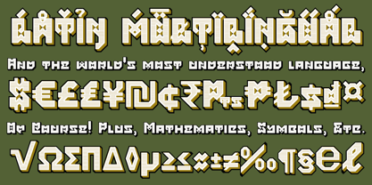
It includes Stylistic Alternates as Extra Monospaced Figures. In 22 styles, with Obliques, both for single display and layer Typesetting, plus OpenType Features & Bonus Blocks Fonts!
This Font-Family has a strong Branding emphasis plus it can be applied in many environments, from Corporative to Decorative fields, plus give a taste to Icons of Modernism or Flavored in an Old Fashion way! It may reminisce atmospheres surrounded by Federalism, Bohemia, showbiz and gastronomy if you will!
NEW TIP! – Letter-Spacing:
Letter-spacing can seem to be a little tight on this font-collection, after a while from had first designed and published, it was discovered that the space between the letters currently set to the half width of the ‘I’ or the ‘stem’ would be better readable and improve legibility if the letter-spacing sum equals to the ‘I’ or stem.
In order to fix that and improve type results the user who picked these fonts can use a simple trick or tweak with the 2 secrets below, that will make the letter-spacing fit perfectly as it should with a one to one equal 100% exact width.
For Web-Fonts Sites Development usage:
1. Set Letter-spacing to 0.075em.
For Type and Design in Adobe Software’s:
2. Or Use Tracking value of ‘35’. Tracking is the opposite of kerning and both Kerning and tracking fields can be found side by side in character panels.
*A future re-edition replacement update is planned to come fix this and a few other more improvements as soon as possible.
Layer Type-Setting Tips:
1. Combine styles into multiple possibilities of Chromatic Typesetting, by ‘central pasting’ layers… You may dislocate layers for improvisations!
2. USE BLOCK-STYLES 1 & 2 also to add default 3D! Change 3D directions by switching Block 1 to Block 2. You may also set the block layer up to the bottom limit and make the 3D direction turn upside down.
*As also, using the suggested tracking or letter-spacing adjustments will enable more combinations results as styles with layered Designs.
Usage Suggestions:
This Typeface can generate Fancy Display Logos and Titling, Remarkable Branding Projects, Labels, Emblems, Crests, Badges, Patterns, etc. For the reason it was called MMC Insignia, it can be suited to everything that has a sense of Royalty or Nobel and increases value on distinguished marks or attributes of Power, plus designs of Excellence!
Type as a Wizard & Go Excelsior!
Greetings,
André, MMC-TypEngine (Dr. Andréground).