Pular para o conteúdo
Pular para o conteúdo principal

Neometra

por deFharo
Estilos Individuais a partir de $24.00 USD
Família completa com 2 fontes: $40.00 USD
A família de fontes Neometra foi desenhada por Fernando Haro e publicada pela deFharo. Neometra contém 2 estilos e opções de pacote familiar. Saiba mais sobre esta família

Neometra Complete Family

2 fontes

Melhor Valor!

Por Estilo:

$20.00 USD

Pacote de 2 estilos:

$40.00 USD

Sobre a família


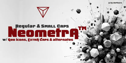
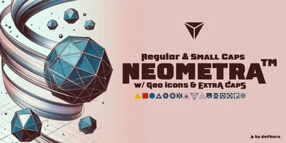
These extremely bold sans serif fonts are designed to stand out with their robustness in any graphic project, seamlessly combining aesthetics and functionality.

With a square proportion and short ascenders and descenders, they offer a balanced and compact appearance. Neometra guarantees superior readability without sacrificing style.

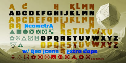
Neometra is available in two variants: Regular and Small Caps. Both versions provide a unique visual experience,

ideal for a wide range of applications:

Titles and Posters: Attract all eyes with its unique presence.

Product Packaging and Logos: Give your products and brands a distinctive and professional touch with easy readability.

  • Publications and Advertising: Perfect for advertising spots, videos, multimedia, and graphic design advertising.

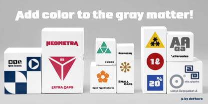
  • Kerning and Metrics Optimization Each font features an impressive set of 784 glyphs. This includes the full Latin Extended-A character set, ensuring compatibility and versatility for multiple languages and applications. I have meticulously worked on the kerning and metrics settings to provide optimal readability at all sizes. This makes Neometra ideal for large, striking titles as well as smaller text.

  • Alternative Numbers and Currency Symbols I have included alternative numbers and a variety of currency symbols, including Bitcoin, so you can customize your designs uniquely and relevantly according to the commercial context.

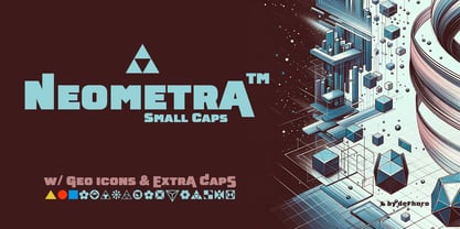
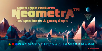
  • Geometric Icons and Alternative Letters Neometra offers 31 geometric icons accessible via the Small Caps function and 52 alternative uppercase letters, specially designed for the beginning and end of words. This variety allows for unprecedented flexibility in creating unique and visually impactful titles.

  • Ideal for High-Impact Designs Neometra is a Display font, perfect for titles, posters, product packaging, logos, publications, advertising spots, videos, multimedia, or graphic design advertising, ensuring that your message is clear and attention-grabbing.

Advanced OpenType Features Neometra is extremely functional. The OpenType features include: Annotation Forms, Contextual Alternates, Denominators, Discretionary Ligatures, Fractions, Initial Forms, Numerators, Oldstyle Figures, Ordinals, Scientific Inferiors, Slashed Zero, Small Capitals, Ligatures, Stylistic Set, Superior letters, Terminal Forms, Titling Alternates.

These features allow you to customize and adapt Neometra to your specific needs, always guaranteeing a professional and polished result, bringing a new dimension to your design projects.

Designers: Fernando Haro

Fundição: deFharo

Estreia na MyFonts: Jul 5, 2024

Neometra

Sobre deFharo

deFharo is the independent type foundry of Spanish graphic and type designer Fernando Haro. With more than 30 years of experience in graphic and advertising design and over a decade devoted to typeface design, Fernando Haro has developed an eclectic body of work that ranges from editorial and corporate typefaces to expressive display, geometric, technological, retro and experimental designs. His approach combines visual character with typographic functionality. Every typeface begins with drawing, proportion and a clear visual idea, and evolves through meticulous work on spacing, metrics, kerning, optical corrections and OpenType features. Rather than following a single recognizable style, deFharo explores different typographic territories according to the personality and purpose of each project. Some families are designed for long-form reading and editorial systems; others are built for branding, headlines, packaging, signage or highly expressive graphic compositions. A strong interest in vector drawing, typographic systems and functional design runs throughout the collection. Alternative characters, small caps, Petite Caps, fractions, numerals, ligatures, symbols and extended language support are frequently developed as integral parts of the typeface rather than as afterthoughts. The result is a growing collection of typefaces designed to be both distinctive and useful — fonts with personality, but also with the technical precision required for professional graphic and editorial work. deFharo typefaces are designed by Fernando Haro and published independently from Spain.

Ler mais

Ler menos