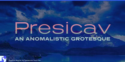
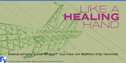
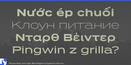
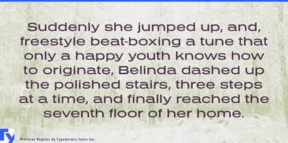
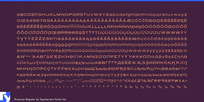
Wide display type often falls into one of two camps. Geometric sans serifs can feel clean but anonymous; extended gothics can bring plenty of character but also a strong historical flavor. Presicav sits between them. It is a geometric postmodern reinterpretation of the broad extended gothic, retaining the expansive stance while introducing unusual joins and stroke resolutions that keep it from reading like a straightforward revival.
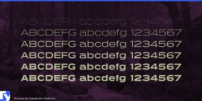
Those proportions remain consistent across the family. In the heavier styles, the broad silhouette and substantial horizontal presence come forward first. As the strokes get thinner, Presicav’s unconventional bowl-to-stem connections become easier to see, giving the lighter styles a slightly more geometric texture without turning them into a different design.
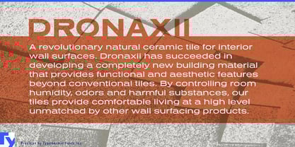
Architectural surfaces are an especially natural setting. Ceramic tile, terrazzo, engineered stone, recycled composites, facade panels, acoustic wall systems, laminates, flooring, and decorative concrete all need typography across collection names, sample books, finish cards, architects’ folders, showroom walls, specification brochures, and trade-show displays. Presicav’s wide stance gives material names enough presence to hold their own beside texture, pattern, and architectural photography.
Contract furniture and workplace systems present a similar opportunity. Modular seating, acoustic pods, movable partitions, collaborative tables, task furniture, storage systems, shelving, and architectural lighting need a recognizable display voice across catalogs, swatch books, showroom graphics, product-family diagrams, and specification material. Heavier styles can establish collection names; lighter weights can carry section openers, diagrams, and short technical display text while keeping the visual system coherent.
Building-product manufacturers can use the same range across facade systems, HVAC equipment, structural components, roofing materials, insulation, architectural hardware, and modular construction products. Presicav can move from a large trade-show product name to a catalog heading or technical presentation without defaulting to a generic industrial sans.
Architecture and interiors publishing can make particular use of its horizontal emphasis. Material guides, furniture annuals, specification supplements, product directories, design reports, and architecture magazines can use Presicav for feature titles, category headings, section openers, and short introductions. Across a spread, its width creates a deliberate band of typography beside plans, material samples, product photography, and technical drawings.
Design exhibitions devoted to furniture, ceramics, architecture, industrial design, transport, or manufactured objects can use Presicav for exhibition titles, wall headings, catalog covers, chronology graphics, and promotional material. Its historical undertone is present without locking the design to one particular period.
Presicav is broad, geometric, and slightly mannered without becoming difficult to use. Its postmodern treatment of the extended gothic gives architectural materials, furniture systems, building products, design publishing, and exhibitions a distinctive display voice across a practical range of weights.