Pular para o conteúdo
Pular para o conteúdo principal

Probeta

por deFharo
Estilos Individuais a partir de $3.00 USD
Família completa com 42 fontes: $231.00 USD
A família de fontes Probeta foi desenhada por Fernando Haro e publicada pela deFharo. Probeta contém 42 estilos e opções de pacote familiar. Saiba mais sobre esta família

Sobre a família


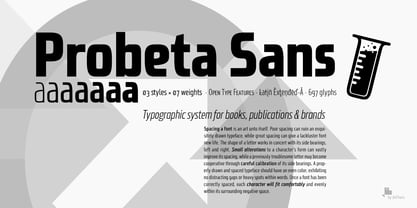
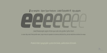
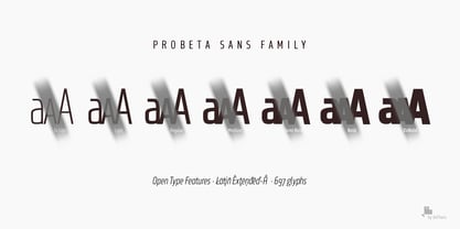
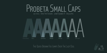
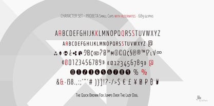
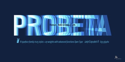
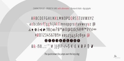
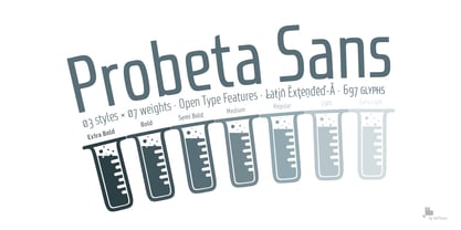
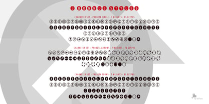
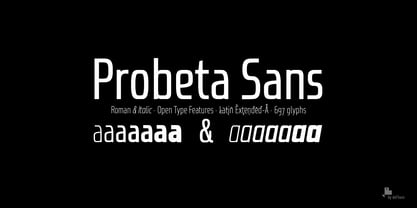
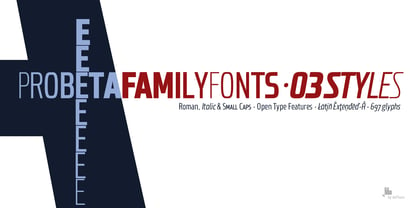
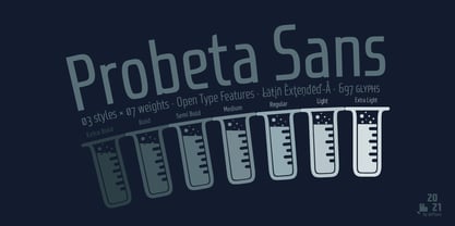
Probeta is an exclusive Sans Serif typeface family, condensed in proportion into three styles: Regular, Italic & Small Caps. Each family consists of 7 weights (Extra Light, Light, Regular, Medium, Semi Bold, Bold and Extra Bold). Plus three bonus fonts: Circle, Cube & arrows


• Includes a bonnus font with the purchase of each style!


After defining all the proportions of the new typeface, and starting from the drawing of the lowercase letter «o», in an exercise of minimalist construction, I have built all the characters, contributing with this technique, morphological coherence and a balanced reading. I have put special interest in defining the width of each character, depending on the relationship with others, then the configuration of the metrics and the exhaustive definition of Kerning, provide maximum readability in paragraph texts and titles.


The use in graphic design, editorial or advertising guarantees originality and difference. Very versatile fonts for billboards, video games, movie titles, logos, publications, etc. They include the symbol of Bitcoin and other Cryptocurrencies.

Designers: Fernando Haro

Fundição: deFharo

Estreia na MyFonts: Jan 4, 2022

Probeta

Sobre deFharo

deFharo is the independent type foundry of Spanish graphic and type designer Fernando Haro. With more than 30 years of experience in graphic and advertising design and over a decade devoted to typeface design, Fernando Haro has developed an eclectic body of work that ranges from editorial and corporate typefaces to expressive display, geometric, technological, retro and experimental designs. His approach combines visual character with typographic functionality. Every typeface begins with drawing, proportion and a clear visual idea, and evolves through meticulous work on spacing, metrics, kerning, optical corrections and OpenType features. Rather than following a single recognizable style, deFharo explores different typographic territories according to the personality and purpose of each project. Some families are designed for long-form reading and editorial systems; others are built for branding, headlines, packaging, signage or highly expressive graphic compositions. A strong interest in vector drawing, typographic systems and functional design runs throughout the collection. Alternative characters, small caps, Petite Caps, fractions, numerals, ligatures, symbols and extended language support are frequently developed as integral parts of the typeface rather than as afterthoughts. The result is a growing collection of typefaces designed to be both distinctive and useful — fonts with personality, but also with the technical precision required for professional graphic and editorial work. deFharo typefaces are designed by Fernando Haro and published independently from Spain.

Ler mais

Ler menos