Embers Awake, Maker.
Welcome to Alkhemyst Foundry! Forged by Alkhemysts, For Makers of Myths and Legends.
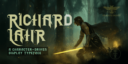
RICHARD LAHR, A CHARACTER-DRIVEN DISPLAY TYPEFACE
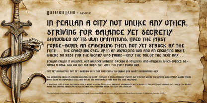
“Forged in fire. Balanced in silence. Sharpened with will.”
Richard Lahr is a display typeface forged for headlines, logotypes, book covers, and typographic spellwork. Inspired by the mythic spirit of Richard Rahl (Sword of Truth), this font family is for Makers who don’t just write, but declare.
Crafted by Alkhemyst Foundry, Richard Lahr is not built with traditional weights. There is no Regular. Bold. Italic. Instead, there are Aspects — three distinct forces forged to mirror the journey of the hero: Core. Blade. Balance. Designed for impact. This font speaks in uppercase only.
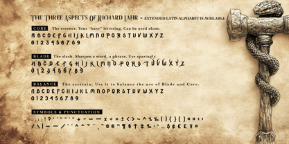
THE ASPECTS
Core — The essence. Your “base” lettering. Can be used alone.
Blade — The slash. Sharpen a word, a phrase. Use sparingly.
Balance — The restrain. Use it to balance the use of Blade and Core. Nuanced version of Core.
The stylistic subtleties and wild contrast reward experimentation.
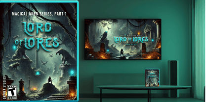
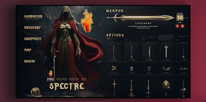
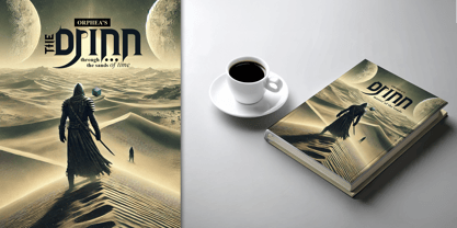
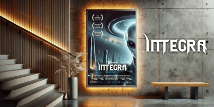
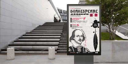
USE IT FOR
• Book covers and chapter openers
• Video game titles and UI elements
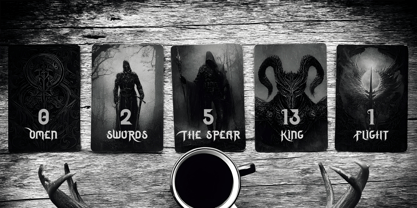
• Tarot decks and fantasy packaging
• Posters, film titles, and immersive branding
• Merch, apparel, or product identity
ALTERNATES FILE
RichardLahrAlternates — This is not a separate style. Not an add-on.
In this version of the Richard Lahr font, all three Aspects — Core, Blade, and Balance — are embedded inside a single font file.
🪄 That means:
When you highlight a letter in Illustrator, you’ll see a dropdown of alternate glyphs (like “A” with different moods).
No digging through menus. No switching fonts. Just click and choose, directly in your canvas.
Live boldly. Design with purpose. And wherever your story takes you...
May the Wind Find You.
— Alkhemyst Foundry
Forged by Alkhemysts, for Makers of Myths and Legends