Pular para o conteúdo
Pular para o conteúdo principal

Segaris Robo

por Kalam
Estilos Individuais a partir de $9.00 USD
A família de fontes Segaris Robo foi desenhada por Wahyu Eka Prasetya, Moch Zamroni e publicada pela Kalam. Segaris Robo contém 1 estilos. Saiba mais sobre esta família

Sobre a família


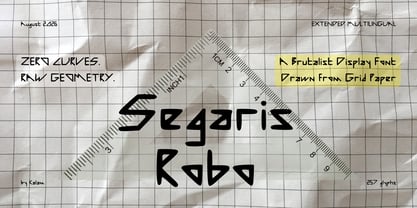
Zero curves. Pure angles. Raw grid precision.

Built with a ruler, shaped by human hands.

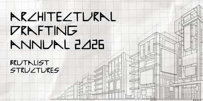
A strictly linear display font drawn on grid paper with 45° diagonal cuts.

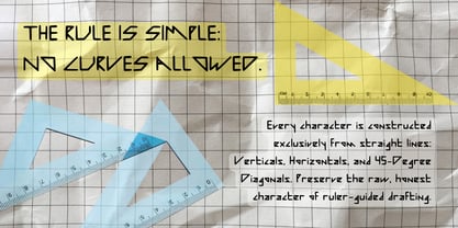
Segaris Robo is a raw, geometric display typeface constructed with a strict visual rule: zero curves. Every single glyph is built exclusively using straight lines—verticals, horizontals, and precise 45-degree diagonals.

Born from a manual drafting process, Segaris Robo started as pencil and ink sketches drawn with a ruler on mathematical grid paper. Instead of over-cleaning the vectors into sterile geometry, the font preserves the natural character, subtle weight shifts, and honest imperfections of hand-drawn drafting.

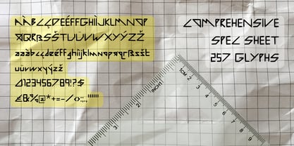
Featuring 257 glyphs with multi-language support, it offers a stark, technical, and modular aesthetic—ideal for designs that require a bold, architectural, or raw industrial edge.

Key Features:

  • Strict Angular Construction: No curved lines—only vertical, horizontal, and 45° diagonal strokes.

  • 2 Distinct Styles: Regular and Slant.

  • 257 Glyphs: Includes Uppercase, Lowercase, Numbers, Punctuation, and Extended Character Set for Multi-Language Support.

  • Handmade Imperfections: Retains the subtle, organic feel of ruler-guided paper sketches.

Ideal Applications:

  • Technical & Architectural Posters

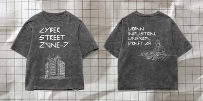
  • Album Covers & Streetwear Graphics

  • Industrial Branding & Logo Design

  • Sci-Fi / Gaming Display Titles

  • Editorial Layouts requiring a raw, modular footprint

Designers: Wahyu Eka Prasetya, Moch Zamroni

Fundição: Kalam

Estreia na MyFonts: Aug 14, 2026

Segaris Robo

Sobre Kalam

Kalam is an independent type foundry born from a long-held dream. For years, designing typefaces was something we always wished to do, and we are truly grateful to finally turn that passion into reality today. We know we aren’t perfect, but we are genuinely dedicated to crafting special, high-quality fonts. Driven by a deep love for layout and visual harmony, we focus on careful vector drafting, clean geometry, and functional design in every character we create. Our goal is simple: to make thoughtful typographic tools that help designers build beautiful, impactful work. Thank you so much for supporting our journey and being a part of our story.

Ler mais

Ler menos