Pular para o conteúdo
Pular para o conteúdo principal

Senlot Didone

por insigne
Estilos Individuais a partir de $35.00 USD
Família completa com 54 fontes: $249.00 USD
A família de fontes Senlot Didone foi desenhada por Jeremy Dooley e publicada pela insigne. Senlot Didone contém 54 estilos e opções de pacote familiar.

Saiba mais sobre esta família

Senlot Didone Complete Family

54 fontes

Melhor Valor!

Por Estilo:

$4.61 USD

Pacote de 54 estilos:

$249.00 USD

Ver mais 44 Ver menos

Sobre a família


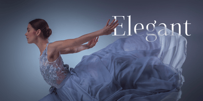
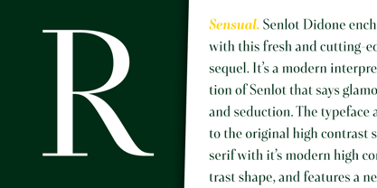
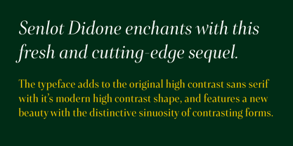
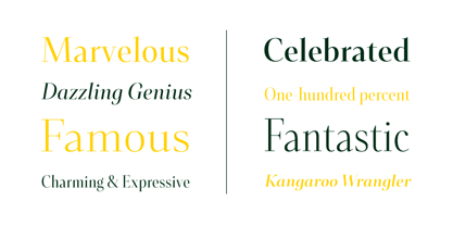
Senlot Didone enchants with this fresh and cutting-edge sequel. It’s a modern interpretation of Senlot that says glamor and seduction. The typeface adds to the original high contrast sans serif with it’s modern high contrast shape, and features a new beauty with the distinctive sinuosity of contrasting forms.


Senlot Didone is the sleek, serifed, high contrast follow-up to Senlot, and it's low contrast sequel, Senlot Sans. A serif typeface suitable for text and display work joined in 2019.


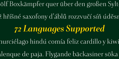
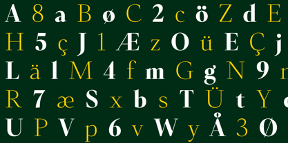
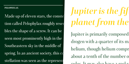
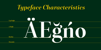
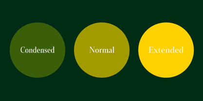
Senlot Didone includes a wide range of OpenType features, including titling capitals, superscripts and subscripts, and oldstyle figures. Senlot Didone is composed of 3 widths: Condensed, Normal, and Extended, with 9 weights and their italics for a total of 54 fonts with more than 800 glyphs. Senlot Didone is a great display typeface for logos, branding, packaging, and advertising. With its broad palate of options, the font covers over 72 Latin-based languages. Dress your text in any of nine separate styles from Thin to Bold.


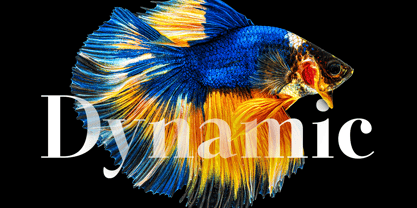
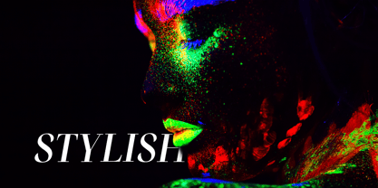
With Senlot Didone, there's no need to compromise on another font with fewer features. Simple, elegant, and versatile, Senlot Didone now makes perfect more possible. Take the show by storm with this high contrast serif. The seductive figure of Senlot Didone is here to entice your viewer.

Designers: Jeremy Dooley

Publicador: insigne

Fundidoras: insigne

Proprietário do design: insigne

Estreia na MyFonts: Feb 10, 2021

Senlot Didone

Sobre insigne

“Type is very much like music,” says Jeremy Dooley. “It is linear, and the notes or phrases have to fit the theme or song.” Jeremy, owner of the one-man foundry, insigne, is a self-taught type designer and a true self-made success story. His label is home to over a hundred font families, many of which have seen great success. Aviano has made our Best of the Year list not just once, but twice and has been featured in Hollywood blockbusters. You may have noticed various iterations of Aviano in Wall Street, Harry Potter, and Thor, and it was used for the branding of Robin Hood. Jeremy considers type to be the foundation of advanced visual communication. One form of communication that the Chattanooga-based designer is drawn to is branding. In 2011, Jeremy, took on the enormous project of coming up with a typeface that would communicate the tone and feeling of his hometown; a font that would effectively brand the city. In 2013, the result, Chatype, was named the official typeface of Chattanooga TN. “Every city needs a brand,” he says, “as every city needs to highlight its own distinctive offerings.” Like many designers, his creations are often the result of his interests. “I especially like seeing my typefaces in movies, on luxury packaging, and for technology companies,” he says. “These are interests of mine, and I often design fonts with those specific applications in mind. It’s very interesting to me that I frequently see fonts used in exactly the way I originally envisioned.” Since he began selling his first font on MyFonts in 2004, the man who will tell anyone who asks, “I’m not really from anywhere,” has continuously drawn inspiration from his many experiences gained from living all over the globe. Want more of Jeremy? The designer sat down with us for an in-depth interview in this issue of Creative Characters.

Ler mais

Ler menos