Senlot Sans Norm Thin
Senlot Sans Norm Thin Italic
Senlot Sans Norm Light
Senlot Sans Norm Light Italic
Senlot Sans Norm Book
Senlot Sans Norm Book Italic
Senlot Sans Norm Regular
Senlot Sans Norm Regular Italic
Senlot Sans Norm Medium
Senlot Sans Norm Medium Italic
Senlot Sans Norm Demi
Senlot Sans Norm Demi Italic
Senlot Sans Norm Bold
Senlot Sans Norm Bold Italic
Senlot Sans Norm Ex Bold
Senlot Sans Norm Ex Bold Italic
Senlot Sans Norm Black
Senlot Sans Norm Black Italic
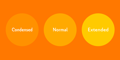
Senlot Sans Extended Thin
Senlot Sans Extended Thin Italic
Senlot Sans Extended Light
Senlot Sans Extended Light Italic
Senlot Sans Extended Book
Senlot Sans Extended Book Italic
Senlot Sans Extended Regular
Senlot Sans Extended Regular Italic
Senlot Sans Extended Medium
Senlot Sans Extended Medium Italic
Senlot Sans Extended Demi
Senlot Sans Extended Demi Italic
Senlot Sans Extended Bold
Senlot Sans Extended Bold Italic
Senlot Sans Extended Ex Bold
Senlot Sans Extended Ex Bold Italic
Senlot Sans Extended Black
Senlot Sans Extended Black Italic
Senlot Sans Condensed Thin
Senlot Sans Condensed Thin Italic
Senlot Sans Condensed Light
Senlot Sans Condensed Light Italic
Senlot Sans Condensed Book
Senlot Sans Condensed Book Italic
Senlot Sans Condensed Regular
Senlot Sans Condensed Regular Italic
Senlot Sans Condensed Demi
Senlot Sans Condensed Demi Italic
Senlot Sans Condensed Medium
Senlot Sans Condensed Medium Italic
Senlot Sans Condensed Bold
Senlot Sans Condensed Bold Italic
Senlot Sans Condensed Ex Bold
Senlot Sans Condensed Ex Bold Italic
Senlot Sans Condensed Black
Senlot Sans Condensed Black Italic