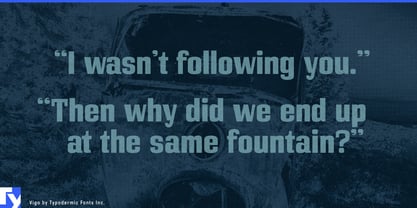
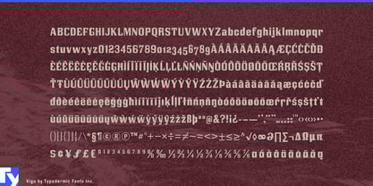
Industrial equipment used to operate behind fences. Increasingly, compact working machines share sidewalks, cycle lanes, loading zones, and neighborhood streets with the people they serve. That creates an unusual branding problem. The typography needs enough weight to make an e-cargo bike, delivery robot, or municipal utility vehicle look dependable, but conventional industrial lettering can make small public-facing machines feel needlessly aggressive. Vigo combines a sturdy, square underlying structure with softened corners, rounded curves, and open counters, giving working equipment a substantial voice without pushing it toward military hardware.
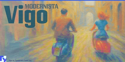
Urban delivery vehicles are a particularly natural fit. Electric cargo bikes, delivery mopeds, compact commercial EVs, and other right-sized fleet vehicles need product names and service identities that work on cargo boxes, battery housings, side panels, dealer displays, and launch campaigns. Vigo’s compact proportions help substantial names fit into limited spaces, while its softened forms keep the result approachable enough for vehicles that spend their working lives among pedestrians, cyclists, shopfronts, and customers.
Autonomous neighborhood delivery robots sharpen the same problem. These machines need to look capable and trustworthy without appearing threatening as they move through sidewalks, bike lanes, driveways, and public plazas. Vigo can handle robot-family names, fleet graphics, service-zone campaigns, charging-station headers, and demonstration-event typography while a quieter sans serif carries screens, instructions, and operational information.
Neighborhood logistics hubs provide a larger environment for the same identity. Microhubs that transfer parcels from vans to cargo bikes and other last-mile vehicles need bay numbers, charging areas, rider zones, pickup points, local-route graphics, and exterior signage. Vigo can give these spaces enough industrial presence to feel functional while remaining appropriate to their neighborhood scale.
The same balance suits compact electric street sweepers, grounds-maintenance vehicles, sidewalk inspection robots, park-service machines, and other civic equipment operating at walking distance from the public. Model names, fleet markings, municipal pilot-program graphics, equipment demonstrations, and service-area headings can look practical without turning every vehicle into heavy industry.
Vigo works best for machinery that has to look competent without looking hostile. Its blocky foundation gives compact vehicles and equipment enough physical presence; softened corners and rounded forms temper that strength for products operating in shared public environments.