Ir directamente al contenido
Ir al contenido principal

APN Chora

por Alphabets Patrick Nell
Estilos individuales desde $32.00 USD
Familia completa de 14 fuentes: $192.00 USD
La familia tipográfica APN Chora fue diseñada por Patrick Nell y publicada por Alphabets Patrick Nell. APN Chora contiene 14 estilos y opciones de paquete familiar. Más información sobre esta familia

Sobre la familia


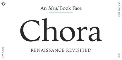
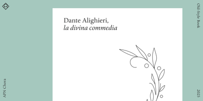
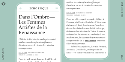
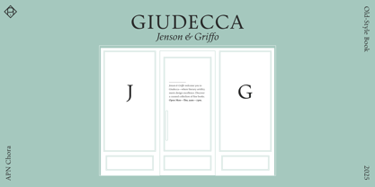
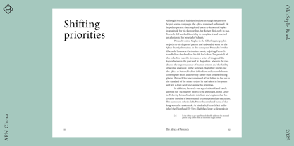
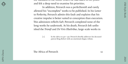
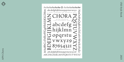
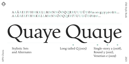
APN Chora is a contemporary old-style typeface, crafted for optimal legibility in books and editorial design, as well as for extended reading on screens.

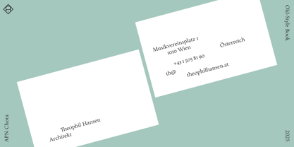
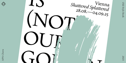
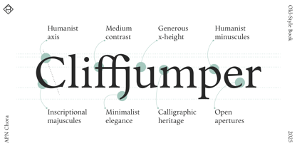
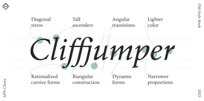
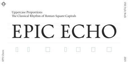
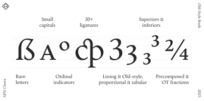
Available in Roman and Italic, each in six weights from Thin to Extra Bold, plus variable fonts, it is fully equipped for the demands of refined typography. APN Chora’s extensive feature set includes small caps, ligatures, multiple figure and stylistic sets, alternate glyphs, fractions, mathematical and musical symbols, arrows, and a selection of ornaments. It supports all European languages written in the Latin script, as well as many others. With its rationalized Renaissance construction, the typeface features a pronounced humanist axis, a generous x-height, and medium stroke contrast for an even typographic color. While optimized for continuous text, its austere elegance also suits display applications. APN Chora embodies the elegance, legibility, and readability that define the finest old-style typefaces.

A detailed specimen PDF with feature descriptions and an overview of all stylistic sets is available here:
https://drive.google.com/drive/folders/18xKceuhjnXcH7Z7Fi9p27HfRVFSC-qdd

Diseñadores: Patrick Nell

Fundición: Alphabets Patrick Nell

MyFonts debut: Mar 24, 2025

APN Chora

Acerca de Alphabets Patrick Nell

Alphabets Patrick Nell is a Viennese type foundry offering bespoke typefaces and typographic consultancy alongside a select range of retail releases. Our designs are informed by in-depth creative and theoretical research. In developing them, we draw on historical and contemporary influences from within and beyond the field of typography, while remaining attentive to the visual tropes that shape how text is seen. Each typeface undergoes thorough testing against technical and aesthetic criteria, with an emphasis on refinement and enduring quality over rapid release. Our typefaces offer extensive character sets, advanced OpenType features, and broad language support. We strive to contribute to the typographic landscape while developing striking and reliable designs suitable for both print and digital media—typefaces we love to use ourselves!

Seguir leyendo

Leer menos