Ir directamente al contenido
Ir al contenido principal

Atwic Hebrew

por Caron twice
Estilos individuales desde $150.00 USD
Familia completa de 19 fuentes: $750.00 USD
La familia tipográfica Atwic Hebrew fue diseñada por Martin Činčár y publicada por Caron twice. Atwic Hebrew contiene 19 estilos y opciones de paquete familiar. Más información sobre esta familia

Sobre la familia


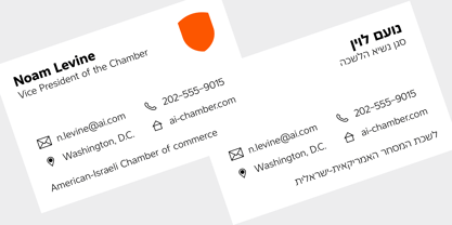
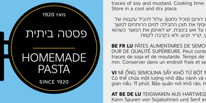
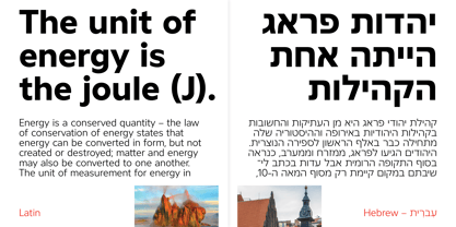
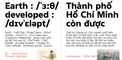
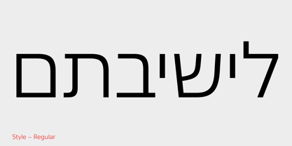
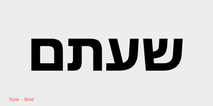
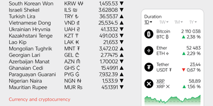
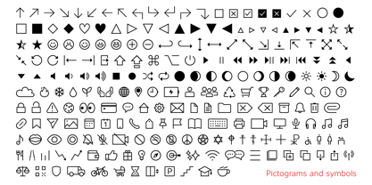
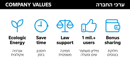
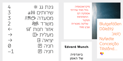
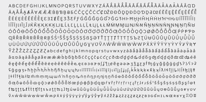
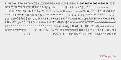
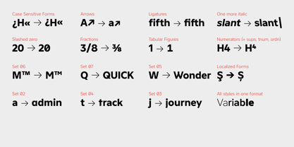
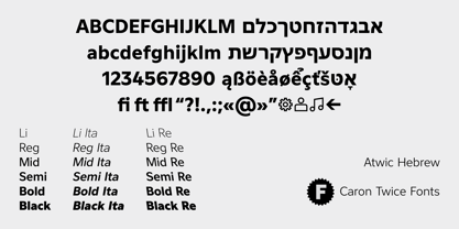
Atwic Hebrew is a clean, simple sans serif typeface whose character aligns with Frutiger, Gill Sans, and Segoe. Today, the sans serif is a modern staple and arguably the defining visual language of contemporary text communication. Containing more than 1,500 characters, Atwic Hebrew supports two writing systems: Latin and Hebrew. It also covers Vietnamese, Pan-African Latin, the International Phonetic Alphabet (IPA), national currency and cryptocurrency symbols, and pictograms (icons). Atwic Hebrew is well suited for neutral, universal use across both print and digital media. It performs reliably in posters, headlines, brand identities, websites, mobile apps, and wayfinding systems. For continuous text, we recommend the Regular and Bold styles; the high x-height and open endstrokes ensure good readability at smaller point sizes and when viewed from a distance. For larger point sizes, such as in posters and headlines, we recommend the Light and Black styles. Atwic Hebrew includes a range of style alternatives. Italics and Reverse Italics. A full phonetic alphabet, used in dictionaries to transcribe pronunciation. These features are complemented by a set of pictograms that support information navigation and can be used in website interfaces, chats, music and video players, wayfinding systems in buildings, and even as expressions of a brand’s values.

Diseñadores: Martin Činčár

Fundición: Caron twice

MyFonts debut: Mar 1, 2026

Atwic Hebrew

Acerca de Caron twice

Caron Twice. Twice the care. Hi, I’m Martin Činčár, the founder of Caron Twice Fonts. In typography, this mark ˇ is called a caron. There are two of them in my last name, hence Caron Twice. These diacritics are very typical for Czech, which is where I come from. Yet as a designer I have often found myself mid-project, with a font that looked perfect, only to discover it had no support for my language or fell apart when the letterforms actually mattered. That is what Caron Twice is about. For over eight years I have been making typefaces the slow way. No quick releases chasing trends but functional, timeless typefaces crafted with deep linguistic and typographic expertise. Every glyph, every diacritic, every script designed with an understanding of not just how a letterform looks, but how it behaves across forty-seven Latin languages, Cyrillic, Greek and Hebrew. Every font here reflects that. More at www.carontwice.com

Seguir leyendo

Leer menos