Ir directamente al contenido
Ir al contenido principal

Bill Corporate Medium

por OGJ Type
Estilos individuales desde $35.00 USD
La familia tipográfica Bill Corporate Medium fue diseñada por Oliver Jeschke, Max Bill y publicada por OGJ Type. Bill Corporate Medium contiene 16 estilos. Más información sobre esta familia

Sobre la familia


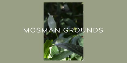
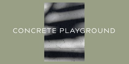
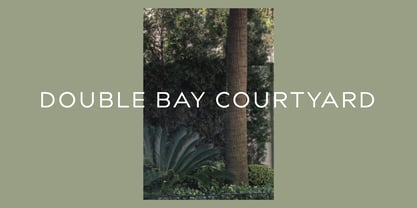
Bill Corporate is a geometric typeface with generous capitals. A modern classic, based on Max Bill’s lettering work, its straightforward and uncompromising construction can be both edgy and sublime. With minimalist letterforms, pointy apexes instead of flat ones, and archetypal proportions, this font family doesn’t follow any trends but strives to achieve a timeless formal vocabulary.


The skeleton of its letters is based heavily on the famous primary shapes of the Bauhaus: square, circle, and triangle. This makes for quite wide uppercase and much narrower lowercase letters. The contrast between uppercase and lowercase benefits inexperienced users, who will be able to get appealing results quickly. At the same time, it’s a powerful tool for seasoned designers, who can employ either case selectively to set the desired typographic course.


Bill Corporate Medium’s 16 styles (including a set of eight lighter-than-light fonts from “Two” to “ExtraLight”) are an excellent choice for editorial design, branding, headlines, and even short to mid-length copy in a wide range of applications and industries. The uppercase letters in particular—with their varied widths and lavish dimensions—are suitable for cosmopolitan and stylish logotypes and wordmarks.


Whenever a timeless, staid, and classy look is demanded, choose Bill Corporate.

Diseñadores: Oliver Jeschke, Max Bill

Fundición: OGJ Type

Fundición original: OGJ Type

MyFonts debut: Sep 14, 2015

Bill Corporate Medium

Acerca de OGJ Type

Berlin-based Oliver Jeschke of OGJ Type creates fonts for all designers who know that typeface selection is essential to high-quality typography. Deeply ingrained in the collection is the over-arching influence of Oliver’s time spent in Basel, Switzerland, and the work of Max Bill. The fastidious attention to detail and draughtsmanship in all of the fonts is immediately apparent. When chosen, any of them could act as a solid foundation for design systems, brand guidelines, or media campaigns.

Seguir leyendo

Leer menos