Ir directamente al contenido
Ir al contenido principal

Boopee

por Typodermic
Estilos individuales desde $69.95 USD
Familia completa de 2 fuentes: $84.95 USD
La familia tipográfica Boopee fue diseñada por Ray Larabie y publicada por Typodermic. Boopee contiene 2 estilos y opciones de paquete familiar. Más información sobre esta familia

Boopee Complete Family

2 fuentes

¡Mejor Precio!

Por Estilo:

$42.47 USD

Paquete de 2 estilos:

$84.95 USD

Sobre la familia


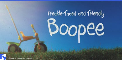
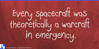
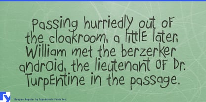
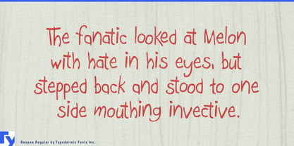
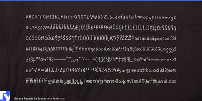
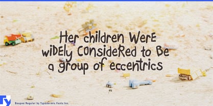
Actual children’s handwriting has something typography usually struggles to reproduce: awkward motor control. Letters wobble, proportions shift, and strokes land in unexpected places. Clean handwriting fonts are easier to use, but they can look like an adult carefully pretending to write like a child. Boopee keeps some of that awkwardness without giving up the practical advantages of type.

Its letterforms were originally drawn with a marker using the non-dominant hand, introducing hesitation and uneven movement at the source rather than adding distress afterward. Stroke widths fluctuate, letters sit a little unpredictably, and shapes sometimes resolve in ways a practiced hand would avoid. The alphabet remains open and legible enough to carry several lines rather than being restricted to a few decorative words.

That makes Boopee especially useful when a child’s written voice needs to appear inside an otherwise typeset design. Diary entries, camp letters, notes between characters, captions on drawings, scrapbook comments, and science-project observations can feel plausibly young while remaining easy to edit and reuse. Activity books, museum worksheets, scavenger hunts, craft projects, and classroom games can use the same voice for prompts such as Try This, Draw It Here, or My Hypothesis.

Boopee also works well for the informal layer around children’s products and environments: name stickers, reward charts, school supplies, craft kits, camp materials, library programs, zoo trails, and science-centre interactives. A conventional typeface can handle permanent information while Boopee supplies the questions, discoveries, labels, and comments that feel as though they came from the child.

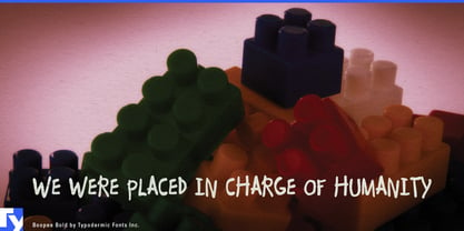
Because repeated forms can quickly expose a handwriting font as mechanical, Boopee includes alternate combinations for common and troublesome pairs, introducing small changes where repetition would otherwise become conspicuous. Bold adds a heavier marker-like voice for headings, emphatic notes, and short kid-written statements.

Diseñadores: Ray Larabie

Fundición: Typodermic

MyFonts debut: Dec 13, 2004

Boopee

Acerca de Typodermic

Welcome to Typodermic Fonts, a spirited type foundry rooted in Nagoya, Japan, started by the Canadian typeface designer, Raymond Larabie in 2001. Our library brims with 500+ diverse typefaces to fuel creativity in graphic design, advertising, web, and app development. As digital type pioneers, we adopted web fonts and app licensing early, consistently pushing the design envelope. With Canadian heart and Japanese precision, we're your global partners in extraordinary typography. Explore Typodermic Fonts—where creativity meets character.

Seguir leyendo

Leer menos