

Ir directamente al contenido
Ir al contenido principal

Brightwood

por TypeSETit
Estilos individuales desde $39.99 USD
La familia tipográfica Brightwood fue diseñada por Monotype y publicada por TypeSETit. Brightwood contiene 1 estilos. Más información sobre esta familia

Sobre la familia


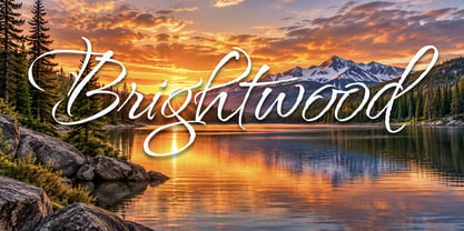
Brightwood features a fluid, graceful construction, with exaggerated loops, extended ascenders, and beautifully curved strokes. With formal calligraphic influence, the design draws inspiration from traditional English Roundhand and ornamental copperplate calligraphy, but has a more contemporary, expressive interpretation.

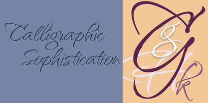
Brightwood shows off its extended capitals and flourishes, giving the lettering an almost theatrical presence, making it particularly effective for prominent display applications.

This elegant and extravagant calligraphic script, is characterized by dramatic swashes, beautifully flowing letterforms, and striking contrasts between delicate hairlines and bold strokes. Its expressive flourishes and graceful proportions create an unmistakably sophisticated appearance, making it ideal for applications where elegance and distinction are desired.

Diseñadores: Monotype

Fundición: TypeSETit

MyFonts debut: Nov 14, 2026

Brightwood

Acerca de TypeSETit

For over four decades, Rob Leuschke has been crafting distinctive lettering and font designs. His career commenced at Hallmark Cards, where he honed his skills across a diverse array of lettering styles. His journey as a font designer evolved from freelance lettering projects within the social expression industry. In the mid-1990s, Rob launched his first commercial font, Arid, through ITC. Following this, he introduced more designs, and in 2004, he began showcasing his work on MyFonts, where many of his creations achieved a spot on the site's Top Ten list. "I was one of the first designers to offer words and phrases as glyphs in my Holiday Font. This innovative approach to using font formats for more than just individual characters would later be referred to as ‘word art.’" Recently, he has started to delve into variable fonts, with American Calligraphic being a notable example, featuring variations in the size and complexity of its swash forms.

Seguir leyendo

Leer menos