Ir directamente al contenido
Ir al contenido principal

Carouselambra

por Typodermic
Estilos individuales desde $69.95 USD
La familia tipográfica Carouselambra fue diseñada por Ray Larabie y publicada por Typodermic. Carouselambra contiene 1 estilos. Más información sobre esta familia

Sobre la familia


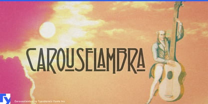
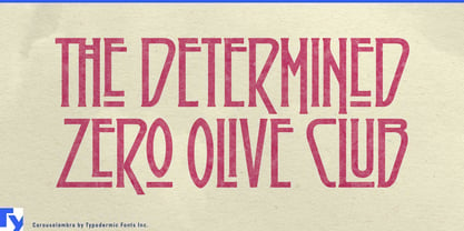
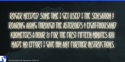
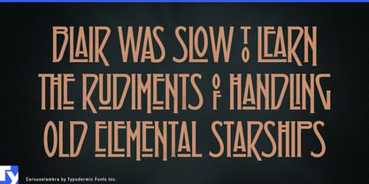
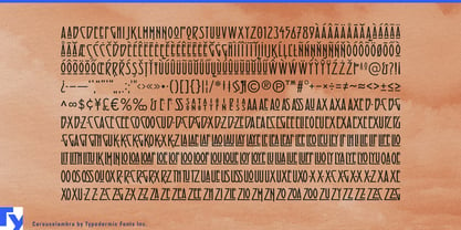
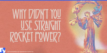
Carouselambra turns words into tall, interlocking emblems. Bars, loops, and extensions reach into neighboring characters, transforming a title from a line of type into a composed mark. Ligatures replace selected letter sequences with fitted-together combinations, giving typed words some of the integration associated with custom lettering.

Its decorative lineage runs through the Arts and Crafts movement, Glasgow Style, and early twentieth-century display lettering. The immediate inspiration was the lettering associated with Led Zeppelin’s Houses of the Holy, where that earlier visual language was recast for a 1970s rock audience. Carouselambra carries forward the structural idea: high vertical proportions and tightly joined letters that make a name feel ceremonial, strange, and culturally established.

This gives Carouselambra a valuable role in fictional world building. Borderlands used it for DLC and mission titles, placing its elaborate forms inside a grubby, violent, darkly comic universe. The lettering suggests history without tying itself to one precise period; it might belong to an ancient order, travelling carnival, outlaw guild, magical commodity, or half-forgotten institution. A few connected letters can imply the decorative traditions of a much larger culture.

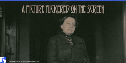
Carouselambra suits expansion-pack names, quest titles, chapter cards, fantasy shop signs, illustrated maps, theatrical productions, festival headliners, record-store graphics, and packaging for botanical cordials, incense, decorative candles, or guitar effects. Its compact proportions help long names cohere as single graphic objects, particularly inside ornamental frames or above illustrations. Pair it with a restrained serif or sans for supporting information while the interlocking title establishes the identity.

Carouselambra gives a newly invented name the visual history of an old institution.

Diseñadores: Ray Larabie

Fundición: Typodermic

MyFonts debut: Jul 16, 2008

Carouselambra

Acerca de Typodermic

Welcome to Typodermic Fonts, a spirited type foundry rooted in Nagoya, Japan, started by the Canadian typeface designer, Raymond Larabie in 2001. Our library brims with 500+ diverse typefaces to fuel creativity in graphic design, advertising, web, and app development. As digital type pioneers, we adopted web fonts and app licensing early, consistently pushing the design envelope. With Canadian heart and Japanese precision, we're your global partners in extraordinary typography. Explore Typodermic Fonts—where creativity meets character.

Seguir leyendo

Leer menos
