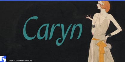
Polished script fonts can sometimes be too accomplished. A family recipe, handwritten food label, or cook’s note may call for something made with care, but flawless flourishes and practiced calligraphy can make the result feel more formal than the subject. Caryn occupies a less common space: the writing looks as though somebody wanted very much to make the words beautiful, even if they had never quite mastered the pen.
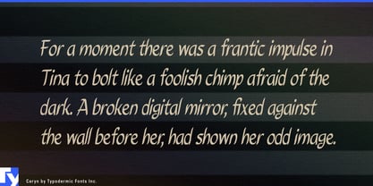
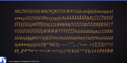
Its rounded strokes, uneven rhythm, open counters, and calligraphic gestures show intention without virtuosity. The letters are neither deliberately sloppy nor artificially distressed; their irregularities feel carefully attempted rather than professionally perfected.
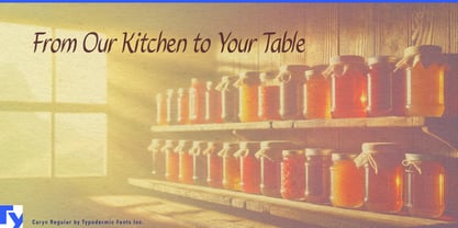
Family-recipe food products are an especially natural fit. Pasta sauces, preserves, pickles, baking mixes, biscuits, granola, soups, condiments, and regional pantry products can use Caryn for recipe names, flavors, founder names, serving suggestions, or short annotations while a conventional serif or sans handles ingredients and formal brand information. On a sauce jar or preserve label, Caryn can suggest the handwriting on a recipe card without forcing the whole package to imitate an old kitchen notebook.
Cookbook and recipe publishing can use the same quality for recipe names, cook’s notes, substitutions, chapter openers, margin annotations, and ingredient callouts. Family-recipe collections, regional cookbooks, baking books, preserving guides, and weeknight-cooking titles are particularly suitable because Caryn’s imperfect calligraphic effort fits the subject better than either polished formal script or deliberately messy handwriting.
Meal kits and cooking services provide a contemporary extension. Recipe subscriptions, prepared-meal boxes, cooking-school kits, and appliance-linked recipe services can use Caryn for dish names, serving suggestions, substitutions, and short directional notes across recipe cards, packaging, emails, and app graphics.
Bakeries, delicatessens, prepared-food counters, specialty grocers, and food halls can use Caryn for bread names, pastry varieties, sandwich specials, prepared-dish labels, shelf cards, takeaway stickers, and seasonal counter graphics. Producer packaging for preserves, honey, dairy products, mushrooms, herbs, and regional food boxes can use it for varieties, harvest notes, batch descriptions, serving ideas, and short package messages.
Caryn looks like somebody tried their best. When a project needs handwriting that suggests care without expertise, it offers an earnest alternative to polished professional calligraphy.