


DearJoe 5 C
por JOEBOB graphics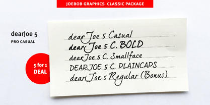

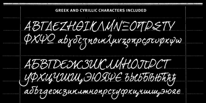
- Aa Glifos
-
¡Mejor PrecioPaquetes de familia
- Estilos individuales
- Especificaciones técnicas
- Licencias
Por Estilo:
$7.80 USD
Paquete de 5 estilos:
$39.00 USD
DearJoe 5 C Family PAck
4 fuentesPor Estilo:
$9.75 USD
Paquete de 4 estilos:
$39.00 USD
Sobre la familia
Diseñadores: Jeroen “Joebob” van der Ham
Fundición: JOEBOB graphics
Fundición original: JOEBOB graphics
MyFonts debut: null

Acerca de JOEBOB graphics
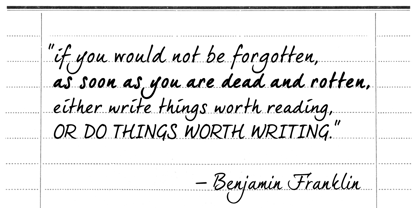
At JOEBOB graphics we like to write. And we like to keep it real.We create our handwritten fonts in such a way that they end up looking like handwriting, not like polished scripts. We do so because we think it’s a good idea to establish a natural feel to our fonts and aim for character and intention over perfection. Little flaws we make while writing are welcomed and left in on purpose because we think it contributes to the idea of being human in an increasingly digital world.Foundry of Jeroen “Joebob” van der Ham.
Seguir leyendo
Leer menos
- Al seleccionar una opción, se actualiza toda la página.