
Ir directamente al contenido
Ir al contenido principal

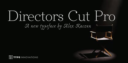
Directors Cut Pro

por Type Innovations
Estilos individuales desde $39.00 USD $27.30 USD
30% Off
Familia completa de 6 fuentes: $169.00 USD $118.30 USD
La familia tipográfica Directors Cut Pro fue diseñada por Alex Kaczun y publicada por Type Innovations. Directors Cut Pro contiene 6 estilos y opciones de paquete familiar. Más información sobre esta familia

Sobre la familia


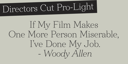
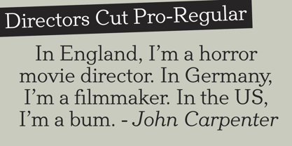
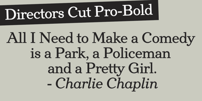
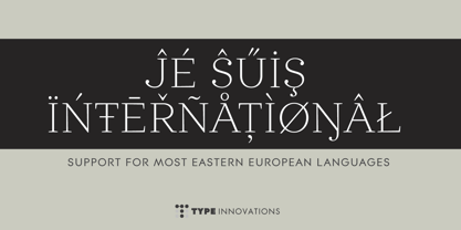
Directors Cut Pro is a compelling new font series designed by Alex Kaczun. It recently won the second place—a commendation in the Canberra Typeface Competition. This handsome Geometric Antique serif design is based on the early 19-century Moderns and Scotch styles, infused with the warm charm of traditional antique, added for interest. Capturing the best of both ages: it's warm, comforting and persuasive. Directors Cut Pro's graceful aspects naturally invite uses at large sizes, for which we have created a stunning and elegant lighter weight. But, this workhorse typeface series incorporates a solid regular weight, along with its italic—ideal for a multitude of text purposes, at varying point sizes. A robust Bold weight is available for headlines and emphasis. Director Cut Pro comes with proportional as well as tabular lining figures for quickly setting up charts and tables. It also contains an extended character set—including most Central European languages. Alex Kaczun is in the process of expanding this typeface series to include additional weights, styles and proportions. Stay tuned! The large Pro font character set supports most Central European and many Eastern European languages.

Diseñadores: Alex Kaczun

Fundición: Type Innovations

MyFonts debut: Nov 5, 2013

Directors Cut Pro

Acerca de Type Innovations

Alex Kaczun is an accomplished type designer and the founder of Type Innovations, specializing in the creation of high-quality typefaces and custom font solutions. With more than four decades of experience in typography, he has built a distinguished career focused on innovative type design, technical excellence, and the development of professional-grade fonts. Much of his career was spent at the premier type foundry Linotype-Hell, where he served as principal type designer. In this role, he contributed to major projects modernizing the Linotype Library, managed the development of The Adobe Font Library, and created Multiple Master fonts for Apple Computer’s QuickDraw technology—work that helped shape the early standards of digital typography. In 1980, Alex joined a pioneering group of entrepreneurs at Bitstream in Cambridge, Massachusetts, where he played a key role in developing the world’s first digital font library. This foundational experience deepened his expertise in both the artistic and technical aspects of typeface design. He later brought his specialized knowledge to Bozell Worldwide, the international advertising agency behind the iconic “Got Milk?” campaign, serving as type director. There he further refined his skills at the intersection of typography, graphic design, and production. In early 2003, Alex joined Bertelsmann’s Bookspan division (formerly Doubleday Books), where he applied his design expertise to create hundreds of book jacket designs and layouts for nearly 20 different book clubs. Most recently, Alex completed a two-year project designing a new family of online fonts for the rebranding of RBC—Royal Bank of Canada. Today, through Type Innovations, Alex continues to design original typefaces and offer professional font customization services. The foundry is dedicated to delivering the highest-quality type products, combining meticulous craftsmanship with technical precision to meet the needs of designers, brands, and creative professionals.

Seguir leyendo

Leer menos