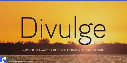
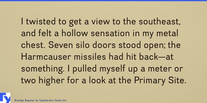
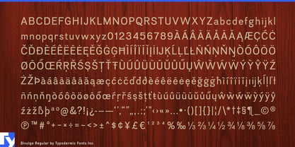
Divulge takes its cues from the period before grotesque sans-serifs settled into familiar twentieth-century conventions. Early examples could be oddly proportioned, soft in unexpected places, and less systematic than the later models that came to define the genre. Divulge borrows some of that uncertainty without reproducing a particular historical typeface; it is a contemporary design that happens to be very comfortable around old-fashioned typography.
That makes it especially useful when an elaborate display face is already doing the attention-grabbing. A whiskey label, tea tin, bottle of bitters, aromatherapy oil, botanical extract, preserve jar, or confectionery package may have room for a decorative Victorian, Tuscan, engraved, or ornamental headline, but considerably less room for everything underneath it. Divulge provides a compact sans-serif layer for origins, dates, varieties, ingredients, batch information, tasting notes, and other details that need to remain part of the same visual world without competing with the headliner.
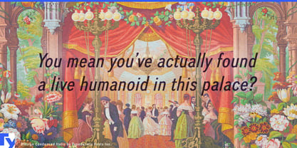
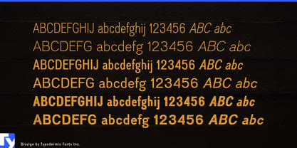
Its condensed proportions matter here. Genuine nineteenth-century grotesques were not necessarily economical with horizontal space, particularly outside headline styles. Divulge keeps some of their irregularity and period compatibility while making that language easier to fit into contemporary packaging. The result can feel historically sympathetic without becoming a reproduction exercise.
The same hierarchy works for apothecary-inspired cosmetics, soaps, grooming products, essential oils, candles, and botanical goods. Decorative lettering can establish the brand while Divulge handles subheads, classifications, locations, short instructions, captions, and product descriptions. It is often most useful when it is not the loudest thing on the package.
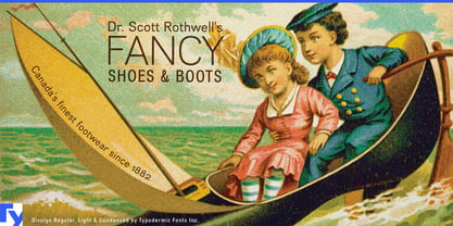
Museums, archives, historical publishing, and cultural exhibitions offer another natural setting. Old photographs, maps, newspaper clippings, advertisements, and period display lettering still need contemporary captions, timelines, section headings, and explanatory material around them. A neutral modern grotesque can feel detached from the source material, while a literal historical imitation can make the whole project feel staged. Divulge occupies the useful space between them.
It can also take the leading role for historical nonfiction covers, exhibition titles, heritage programs, menus, and institutional graphics where something restrained is preferable to an ornate period face. Its slightly unfamiliar proportions suggest an earlier grotesque tradition without pretending to come from a specific year or printing shop.
Divulge is less a historical typeface than a contemporary accomplice to history. Its strongest trick may be knowing when to stay compact and let the fancy typeface have the headline; then it can get on with divulging the details.