






Ir directamente al contenido
Ir al contenido principal

Exedra

por Tipo Pèpel
Estilos individuales desde $24.00 USD
Familia completa de 66 fuentes: $129.00 USD
La familia tipográfica Exedra fue diseñada por Josep Patau Bellart y publicada por Tipo Pèpel. Exedra contiene 59 estilos y opciones de paquete familiar. Más información sobre esta familia

Exedra Complete Family

66 fuentes

¡Mejor Precio!

Por Estilo:

$1.95 USD

Paquete de 66 estilos:

$129.00 USD

Véase 56 más Ver menos

Sobre la familia


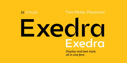
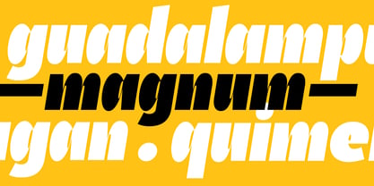
Exedra is a contemporary sans serif designed to offer exceptional versatility without sacrificing personality. Conceived as a complete typographic system rather than a simple font family, it combines geometric clarity with subtle humanistic influences, allowing it to perform equally well in expressive display typography and demanding text settings. Its clean construction, generous proportions and carefully balanced rhythm create a typeface that feels modern, approachable and remarkably adaptable across a wide range of applications.

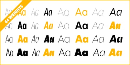
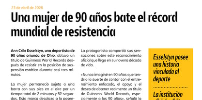
The family includes 32 carefully crafted styles, covering multiple weights and widths with matching true italics, making it easy to build sophisticated typographic hierarchies while maintaining visual consistency throughout a project. From elegant editorial layouts and corporate identities to branding, packaging, advertising, user interfaces and motion graphics, Exedra responds naturally to every design challenge.

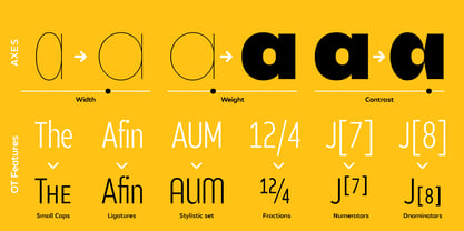
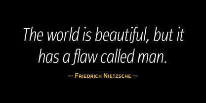
A defining characteristic of Exedra is its progression across width, weight and contrast, offering designers an extensive creative palette while preserving a unified visual language. The family moves effortlessly from delicate, airy compositions to bold, impactful headlines, providing flexibility without compromising readability.

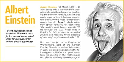
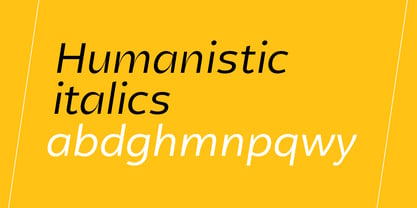
Unlike mechanically slanted companions, Exedra features genuine humanistic italics that introduce warmth, rhythm and movement while remaining perfectly integrated with the roman styles. This gives emphasis a natural voice and makes the family particularly effective for editorial typography, premium branding and sophisticated visual communication.

Professional OpenType features further extend its capabilities, including real small caps, ligatures, stylistic alternates, fractions, numerators, denominators and case-sensitive punctuation. These details make Exedra an excellent choice for designers who value refined typography and complete typographic control.

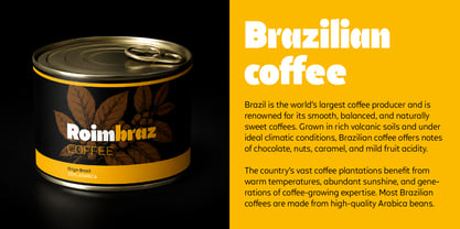
Neutral enough to support any visual identity yet distinctive enough to leave a memorable impression, Exedra is a typeface built for contemporary design. It offers the precision expected from a modern sans serif while retaining the warmth and subtle character that make typography engaging to read. Whether used for a bold visual identity, a magazine, a packaging system or a digital interface, Exedra provides the consistency, flexibility and personality needed to become the backbone of any design project.

Diseñadores: Josep Patau Bellart

Fundición: Tipo Pèpel

MyFonts debut: Jul 9, 2026

Exedra

Acerca de Tipo Pèpel

Located in a small town, Les Borges Blanques, Spain, Tipo Pèpel is a digital type foundry run by Josep Patau. The self-taught designer began producing experimental typefaces in 1996 and started selling them through MyFonts in 2011. His debut font, Anduaga, was a revival from Joseph de Anduaga y Garimberti, the XVII´s famous spanish calligrapher. Since then, his library had expanded to include nearly two dozen font families, each of which is unique and reflects the small country town he comes from with a familiar rural feel. Some of Josep’s best selling typefaces, including Pobla, Bridone, and Cinta, really demonstrate the impact his home has on his designs, while Boxed, a semi-modular geometric font, is a step outside of this theme. “All of my projects excite me and I put my best into each of them, doing everything with my own two hands,” Josep says. “I treat them all like my children.” With a focus on the details and creating high quality drawings, each of his fonts offers an extended character map that is fully capable with OpenType features. He also diligently insures that each of his typefaces is legible in all sizes. “I think that this is one of my goals because I always begin my designs by thinking about the final use if the font,” he says. “I worry about this a lot, so I do thousands of tests before launching the final font to ensure high quality standards and full satisfaction for final users.”

Seguir leyendo

Leer menos