Ir directamente al contenido
Ir al contenido principal

FHA Broken Gothic™

por Fontry West
Estilos individuales desde $15.00 USD $11.25 USD
25% Off
Familia completa de 13 fuentes: $25.00 USD $18.75 USD
La familia tipográfica FHA Broken Gothic fue diseñada por Michael Gene Adkins, James L. Stirling y publicada por Fontry West. FHA Broken Gothic contiene 13 estilos y opciones de paquete familiar. Más información sobre esta familia

Sobre la familia


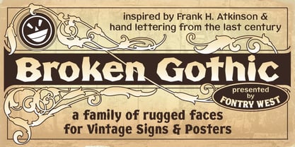
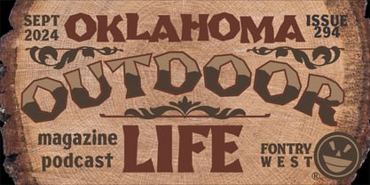
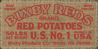
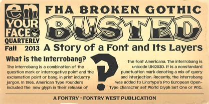
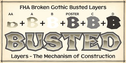
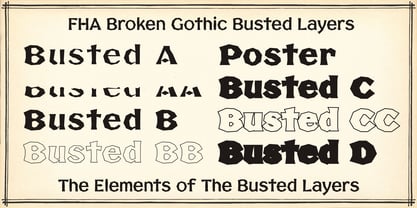
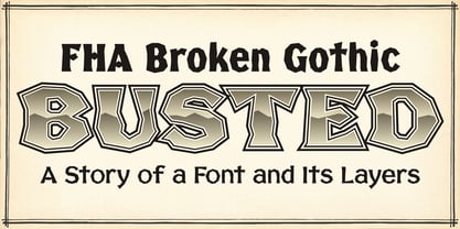
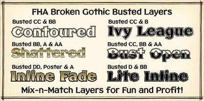
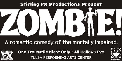
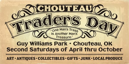
More than a century ago, Frank H. Atkinson presented this hand lettered style as Broken Poster. It was one of a hundred styles he demonstrated in his manual on sign painting. Even before his book was published (and certainly after), Broken Poster was a favorite with sign painters and letterers. It has graced show cards and movie posters, signs and windows displays, and advertisements of all varieties. We presented the our first digital revival of this classic in 2000. It is long overdue for an upgrade. Broken Gothic expands the basic Broken Poster to four weights, two specialty formats and some cool layed effects. The language base includes Greek, Cyrillic, Latin A, and some of Latin B and Latin Extended. There are also some nice alternates and ligatures. All weights are quite suited to posters, headlines, display copy, web headers, etc. At first glance, Broken Gothic may seem to have limited uses. Give it a chance and it will surprise you. Broken shouts out that there is a sale, a giant monster or the end of the world. Broken Gothic is comfortable in a wide range of themes and applications from zombie movie titles to salsa jar labels. While I can't recommend it for text, Broken is great for headers, banners, signs, titles, product presentation and other display applications. When you need a rough customer, Broken Gothic fills the bill.

Diseñadores: Michael Gene Adkins, James L. Stirling

Fundición: Fontry West

MyFonts debut: Sep 4, 2013

FHA Broken Gothic™ is a trademark of Fontry West.

Acerca de Fontry West

Before the internet went big, when access was still dial-up, Mike Adkins and James Stirling sat in a room with the song of a vinyl cutter singing in the background. It was summer in Oklahoma, hot and humid, even at night. It was late or early, depending on which direction you were coming from. On the side of a manila envelope was scribbled a word: "Fontry." It was a made-up word to identify the contents. Inside the tattered folder were thoughts and ideas on scraps of paper—sketches of letterforms. Between the two men, who were hanging on to wakefulness with caffeine and stubbornness, there was a discussion, a discourse concerning the future. Pages were pulled from the envelope and spread out to share an idea. Did they have any background in fonts or typography? No. What they had was a feel for letterforms and whatever their instructors at the local university had been able to drum into their heads. That was enough to start. There have been many starts and a lifetime of learning. Not every product has been a success, but a few have found their way into type history. The work of the two men has surfaced in every aspect of human graphic endeavor. There is no medium that has not felt the momentary touch of their creativity. Together, with the manic smile of their mascot, they are The Fontry®.

Seguir leyendo

Leer menos