

Ir directamente al contenido
Ir al contenido principal

FHA Condensed French

por Fontry West
Estilos individuales desde $25.00 USD
Familia completa de 3 fuentes: $25.00 USD
La familia tipográfica FHA Condensed French fue diseñada por Michael Gene Adkins, James L. Stirling y publicada por Fontry West. FHA Condensed French contiene 3 estilos y opciones de paquete familiar. Más información sobre esta familia

Sobre la familia


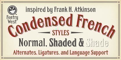
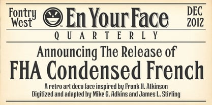
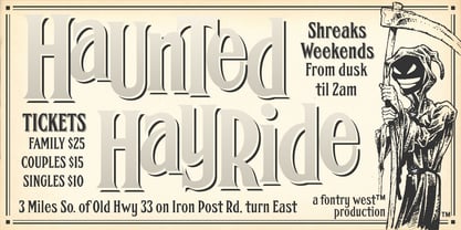
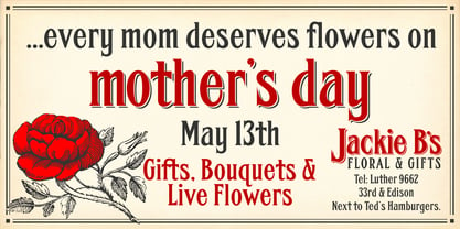
FHA Condensed French One could speculate that FHA Condensed French probably started life as wood type for displays, headlines and posters. The exaggerated sharp serifs and condensed forms were not uncommon for that period. At some point, sign painters picked up Condensed French added their own character. At the end of the nineteenth century, Frank H. Atkinson included Condensed French in his samples of lettering for his book, ”Sign Painting, A Complete Manual.” This book became one of the definitive guides for signwriting and hand lettering. In 1999, Mike Adkins digitized Condensed to add to our Atkinson collection. For its re-release, Condensed French has been updated with more language support, ligatures, and OpenType alternates. It has true vintage character but still plays well in more modern designs. A font for all seasons, the condensed forms and sharp serifs fit in every layout from wildwest days posters and creepy film credits to Christmas ads and Mother’s Day cards. While I can’t really see FHA Condensed French as the font for phone aps or video game text, it will provide impact to logos, branding, and product labeling.

Diseñadores: Michael Gene Adkins, James L. Stirling

Fundición: Fontry West

MyFonts debut: Dec 3, 2012

FHA Condensed French

Acerca de Fontry West

Before the internet went big, when access was still dial-up, Mike Adkins and James Stirling sat in a room with the song of a vinyl cutter singing in the background. It was summer in Oklahoma, hot and humid, even at night. It was late or early, depending on which direction you were coming from. On the side of a manila envelope was scribbled a word: "Fontry." It was a made-up word to identify the contents. Inside the tattered folder were thoughts and ideas on scraps of paper—sketches of letterforms. Between the two men, who were hanging on to wakefulness with caffeine and stubbornness, there was a discussion, a discourse concerning the future. Pages were pulled from the envelope and spread out to share an idea. Did they have any background in fonts or typography? No. What they had was a feel for letterforms and whatever their instructors at the local university had been able to drum into their heads. That was enough to start. There have been many starts and a lifetime of learning. Not every product has been a success, but a few have found their way into type history. The work of the two men has surfaced in every aspect of human graphic endeavor. There is no medium that has not felt the momentary touch of their creativity. Together, with the manic smile of their mascot, they are The Fontry®.

Seguir leyendo

Leer menos