

Ir directamente al contenido
Ir al contenido principal

Fluctuation™

por Typodermic
Estilos individuales desde $69.95 USD
Familia completa de 12 fuentes: $169.95 USD
La familia tipográfica Fluctuation fue diseñada por Ray Larabie y publicada por Typodermic. Fluctuation contiene 12 estilos y opciones de paquete familiar. Más información sobre esta familia

Sobre la familia


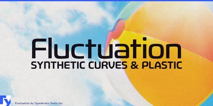
Contemporary hardware is designed with increasing care, yet its typography often feels like an afterthought. Heat pumps, air purifiers, home batteries, EV chargers, and premium appliances all feature refined industrial design, but their lettering often falls between generic sans serifs or overtly futuristic styles, neither of which suit products meant to live comfortably in domestic and work environments. Fluctuation bridges that gap.

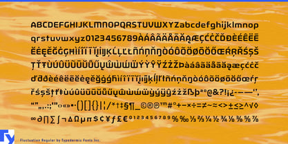
This geometric display sans takes its cues from industrial design rather than science fiction. Subtly molded curves, compact proportions, and distinctive cathedral-inspired A and V echo the language of manufactured objects, giving product names and model designations a sense of belonging on the enclosure itself, rather than appearing as labels added at the last moment.

Fluctuation is particularly well suited to residential climate systems, air quality products, and home energy equipment. It gives heat pump series, ventilation systems, home batteries, EV chargers, and solar energy products a visual identity that feels engineered without feeling cold or industrial. The compact proportions neatly accommodate long model names, while the heavier weights provide enough substance to stand beside substantial hardware.

The same qualities make Fluctuation a natural choice for premium appliances where industrial design influences purchasing decisions. It works especially well for product families, model names, and launch graphics, alongside a quieter text face for specifications and interface copy. Its industrial design origins also extend naturally to engineered furnishings. Ergonomic seating, modular workplace systems, acoustic office pods, adjustable desks, and architectural lighting all benefit from typography that reflects the same balance of engineering and refinement.

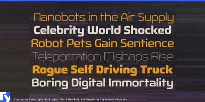
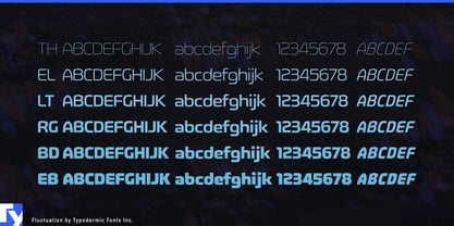
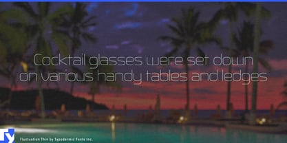
Across the family, lighter weights reveal the underlying construction while heavier styles emphasize its molded architectural forms. Wherever industrial design has been given careful attention, Fluctuation helps ensure the typography feels like part of the product rather than an afterthought.

Diseñadores: Ray Larabie

Fundición: Typodermic

MyFonts debut: Apr 30, 2013

Fluctuation™ is a trademark of Typodermic.

Acerca de Typodermic

Welcome to Typodermic Fonts, a spirited type foundry rooted in Nagoya, Japan, started by the Canadian typeface designer, Raymond Larabie in 2001. Our library brims with 500+ diverse typefaces to fuel creativity in graphic design, advertising, web, and app development. As digital type pioneers, we adopted web fonts and app licensing early, consistently pushing the design envelope. With Canadian heart and Japanese precision, we're your global partners in extraordinary typography. Explore Typodermic Fonts—where creativity meets character.

Seguir leyendo

Leer menos
