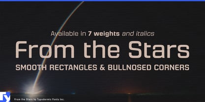
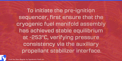
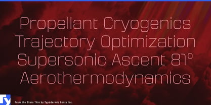
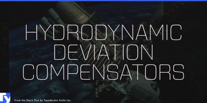
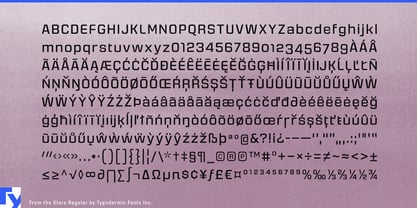
A lot of futuristic typography still looks as though the future is supposed to be dangerous. Hard corners, aggressive diagonals, and military or racing cues suit some machines, but emerging technology increasingly has to share homes, hospitals, workplaces, sidewalks, and public spaces with ordinary people. From the Stars keeps the compact, squared construction of technical display type, then softens the geometry with rounded, bullnosed corners.
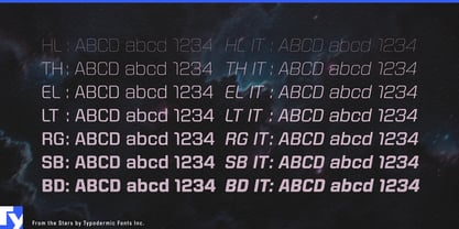
Its proportions draw on the closed, efficient forms of square sans serifs, but the softened transitions give the family a less severe character. Seven weights from Hairline through Bold, each with a matching italic, let the same visual language move from fine technical headings to substantial product names and campaign graphics.
Human-facing robotics is an especially natural setting. Delivery robots, hospitality robots, autonomous cleaning equipment, hospital logistics systems, warehouse robots, and emerging humanoid platforms all need identities that look engineered without making the machine appear unnecessarily hostile. From the Stars can handle robot model names, charging-station graphics, fleet dashboards, exhibition walls, launch campaigns, and short interface headings.
Smart-home and residential energy equipment present a similar problem. Heat pumps, home batteries, smart electrical panels, air purifiers, robotic vacuums, ventilation systems, water-management equipment, thermostats, and residential EV hardware increasingly sit in visible domestic environments. From the Stars gives device names, enclosure graphics, retailer displays, control screens, and companion apps a technical identity without making the product feel like factory equipment.
The family name also makes space technology a natural fit. Satellite communications, earth-observation platforms, ground stations, telemetry systems, orbital weather services, and commercial spacecraft suppliers can use From the Stars for platform names, mission dashboards, conference displays, technical presentations, and ground-system interfaces. Telescope manufacturers, astrophotography cameras, observatory controls, star trackers, planetarium systems, and astronomy software can draw on the lighter weights for diagram-like headings while heavier styles carry model names and exhibition titles.
Autonomous mobility and assistive technology extend the same idea into campus shuttles, airport people movers, delivery vehicles, rehabilitation robotics, mobility aids, home health equipment, and patient-facing devices.
From the Stars is technical typography for a future that has to live around people. Its compact square structure still looks at home beside sensors, screens, satellites, and machinery; the softened corners make that language easier to carry into homes, public spaces, healthcare, and everyday mobility.