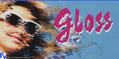
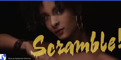
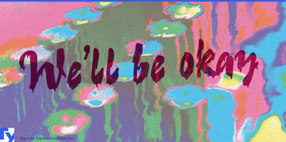
Gloss is for projects that need glamour with something wrong with it.
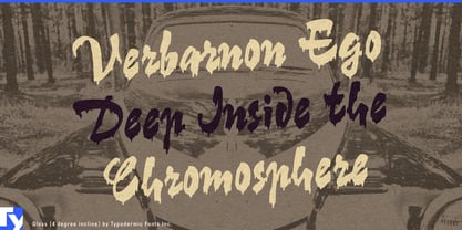
Its foundation is a sweeping mid-century display script, but the finish has been deliberately spoiled. Ragged edges, irregular paint drips and shifting connections turn polished sign lettering into something smeared, wet and unruly. Gloss occupies an unusual space: feminine without becoming sweet, rebellious without borrowing the hard visual language of hardcore punk, and flashy without looking conventionally luxurious.
That combination makes it especially useful for youth-oriented beauty. Hair-color collections, nail lacquer, press-on nails, false lashes, lip gloss and high-impact cosmetics can treat the lettering almost like part of the product; the drips suggest dye, polish, gloss or pigment that has escaped its container. Collection names, shade campaigns and limited-edition packaging can lean into the mess rather than hide it.
Gloss also fits bratty teen fashion and accessories: platform footwear, novelty handbags, fashion jewelry, sunglasses, hair accessories and trash-glam capsule collections that need something more insolent than an ordinary script but less aggressive than distressed block lettering. It can carry campaign headlines, shoebox graphics, hangtags and storefront promotions with the swagger of sign-painter forms pushed into smeared-eyeliner territory.
Fashion dolls, collectible characters and beauty tie-ins are another natural fit, particularly when the persona is theatrical, excessive or knowingly bad-behaved rather than cute. Its punk connection belongs on the glam and post-punk side: dyed hair, thrift-store glamour, plastic jewelry and improvised fashion rather than stencils and photocopied manifestos. That same language can work for girl-band graphics, drag and burlesque promotions, trash-glam nightlife and entertainment built around rebellious young women.
The drips also give Gloss a literal role in custom paint and lacquer. Motorcycle tanks, helmets, custom vehicle graphics, paint-marker campaigns and specialty coatings can make the lettering look freshly applied; tilting the composition strengthens the effect by letting the drips appear to obey gravity.
Gloss is deliberately not an all-purpose script. It works best when beauty, mess and showmanship need to occupy the same word.