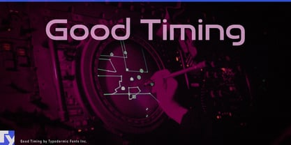
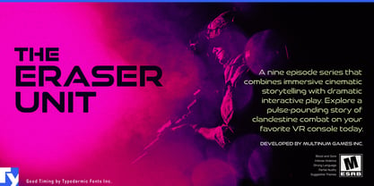
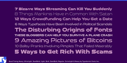
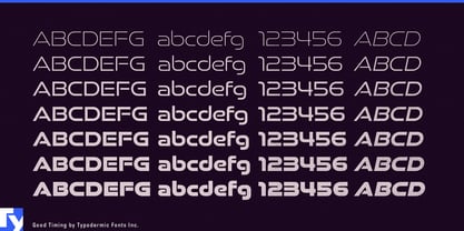
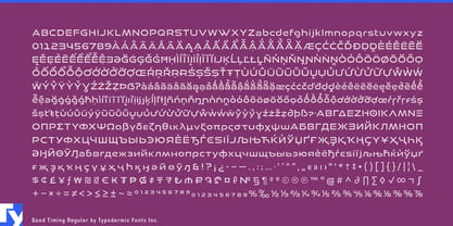
Good Timing was created for projects that like the wide, streamlined character of Good Times but need lowercase and a deeper typographic hierarchy. Its broad geometric forms retain the technical feel of the earlier family, while mixed-case text makes it practical for product names, modes, messages, and short explanatory copy rather than display headlines alone.
That distinction matters when an identity has to extend from a product name into the system surrounding it. Home batteries, solar inverters, smart electrical panels, bidirectional chargers, and energy-management platforms may need equipment names, operating modes, charging states, setup screens, and concise status messages. Good Timing can keep those elements in the same visual language without forcing every line into capitals.
Connected fitness and training hardware present a similar problem. Smart exercise bikes, rowing machines, treadmills, cycling trainers, strength stations, and recovery devices move constantly between product names, workout titles, user profiles, interval labels, performance summaries, and short coaching messages. Good Timing can handle the large technological moments while sentence case gives supporting information a calmer second level.
Vehicle interfaces and companion systems are another natural setting. EV dashboards, e-bike displays, charging screens, drive-mode graphics, instrument-cluster headings, and vehicle apps combine large mode names with navigation destinations, profiles, range messages, charging information, and settings.
The same principle applies to prosumer technology such as audio equipment, imaging hardware, drones, 3D printers, and fabrication tools. Model-family names, operating modes, presets, companion software, onboarding screens, and launch graphics can remain visibly related across both physical products and digital interfaces.
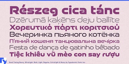
Support for Latin-based languages, Greek, and Cyrillic also helps internationally deployed products retain the same identity across scripts and regional markets.
Good Timing solves the problem that appears after a wide technological display style has been chosen and the project needs names, settings, messages, and short mixed-case text that still belong to it.