
Ir directamente al contenido
Ir al contenido principal

Gravtrac

por Typodermic
Estilos individuales desde $69.95 USD
Familia completa de 56 fuentes: $169.95 USD
La familia tipográfica Gravtrac fue diseñada por Ray Larabie y publicada por Typodermic. Gravtrac contiene 56 estilos y opciones de paquete familiar. Más información sobre esta familia

Gravtrac Complete Family

56 fuentes

¡Mejor Precio!

Por Estilo:

$3.03 USD

Paquete de 56 estilos:

$169.95 USD

Véase 46 más Ver menos

Sobre la familia


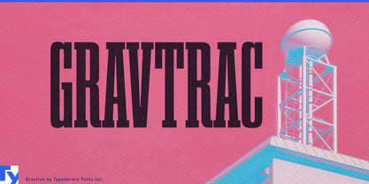
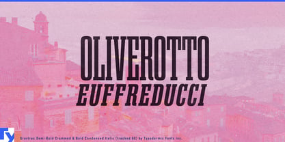
A product name that works across a brochure can become a problem the moment it has to fit on a charger cabinet, robot mast, shipping container, rack enclosure, or narrow trade-show panel. Switching to another typeface solves the space problem but weakens the visual system. Gravtrac was built for exactly this kind of pressure.

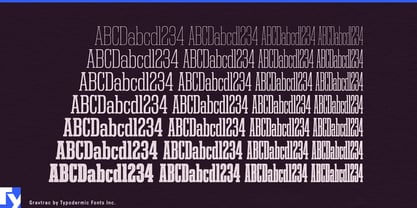
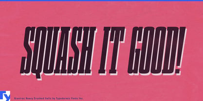
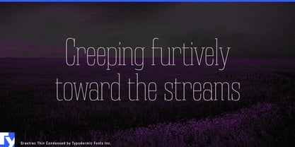
The family moves through four progressively narrower widths: Condensed, Compressed, Crammed, and Crushed. Even Condensed starts narrow; Crushed pushes the idea close to its practical limit. Each width spans seven weights from Thin through Heavy with matching italics, creating 56 styles that can adapt to very different amounts of horizontal space without abandoning the same basic letterforms. The italics become less inclined as the widths tighten, helping the narrowest styles remain balanced.

That makes Gravtrac particularly useful for energy infrastructure. EV fast chargers, grid-storage cabinets, power-conversion systems, commercial battery equipment, inverters, and building-energy hardware often provide tall, narrow surfaces crowded with screens, connectors, ventilation, and regulatory information. A product-family name can begin in Condensed on a launch page, then move through Compressed or Crammed when the same identity has to fit an equipment fascia.

Industrial automation creates the same problem at a larger scale. Warehouse robots, autonomous forklifts, conveyor modules, robotic palletizers, machine-vision systems, and factory cells need typography across machinery, technical brochures, control cabinets, booth graphics, manuals, and product diagrams. Gravtrac can keep a long model or platform name recognizable across those different surfaces while heavier styles handle equipment markings and lighter styles take on diagrams and technical headings.

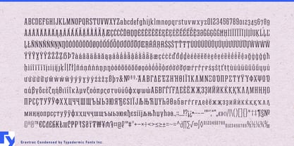
Freight and logistics provide another natural environment. Shipping containers, trailers, rail equipment, cargo terminals, depot signs, fleet graphics, and equipment identifiers are built from long rectangles and fixed spaces. Gravtrac’s tall slab-serif structure gives these systems a strong physical presence without imitating historical railway lettering. Its Latin, Greek, and Cyrillic coverage can also support international transport systems operating across multiple script regions.

Data-center infrastructure presents a newer version of the same design problem. Rack systems, liquid-cooling hardware, power-distribution units, network appliances, and modular data-center equipment increasingly need their own product identities while leaving most of the front panel available for controls, ports, airflow, and status information.

The width progression can also solve fixed-space problems in motorsport timing graphics, arena ribbon boards, cycling leaderboards, player introductions, and tournament brackets. A design can use Condensed for most entries and step progressively narrower only when a long surname, team name, or sponsor demands it.

Gravtrac is not simply one ultra-condensed display face repeated at several widths. Thin Condensed can create an airy technical heading; Heavy Crushed can turn a long name into a dense vertical block. The useful part is everything between them. When a design system has to move from a wide presentation to a narrow machine panel, container marking, equipment label, or scoreboard module, Gravtrac lets the typography change width instead of changing identity.

Diseñadores: Ray Larabie

Fundición: Typodermic

MyFonts debut: Oct 22, 2020

Gravtrac

Acerca de Typodermic

Welcome to Typodermic Fonts, a spirited type foundry rooted in Nagoya, Japan, started by the Canadian typeface designer, Raymond Larabie in 2001. Our library brims with 500+ diverse typefaces to fuel creativity in graphic design, advertising, web, and app development. As digital type pioneers, we adopted web fonts and app licensing early, consistently pushing the design envelope. With Canadian heart and Japanese precision, we're your global partners in extraordinary typography. Explore Typodermic Fonts—where creativity meets character.

Seguir leyendo

Leer menos
