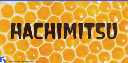
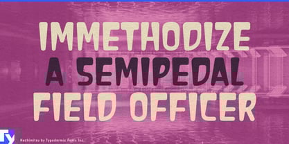
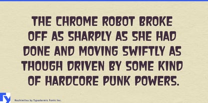
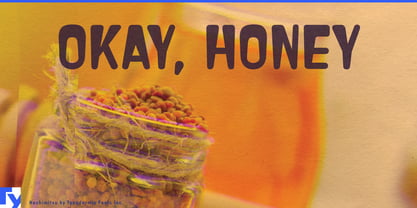
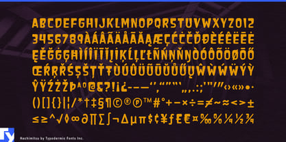
Retro Japanese display lettering can easily collapse into familiar signals: brush forms, restrained nostalgia, manga exaggeration, or atomic-age kitsch. Hachimitsu takes a stranger route. Its letterforms are broad and heavy across the shoulders, then narrow noticeably toward the baseline, creating a top-heavy balance that makes words seem larger than the space they occupy. The effect is cheerful, commercial, and slightly improbable; the letters look as though they are looming over whatever sits beneath them.
That unusual distribution of weight grew from an observation of Japanese sign lettering rather than an attempt to reproduce a particular historical alphabet. Rounded forms keep Hachimitsu approachable, while the narrow footing prevents all that mass from settling into ordinary bubble lettering. The result has an affinity with Showa-era commercial graphics, kaiju advertising, and mid-century Japanese science fiction without depending on brushwork, distressed printing, or American creature-feature conventions.
Monster toys and collectibles are an especially natural fit. Sofubi packaging, model-kit boxes, designer toys, robot figures, garage kits, creature cards, collector events, and fictional hobby brands all need lettering capable of standing beside busy illustrations and oversized characters. Hachimitsu has enough presence to compete with a giant monster on the same package; its uneven proportions make the type feel like part of the spectacle rather than a neutral label added afterward.
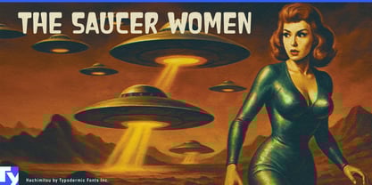
The same qualities suit kaiju and retro-science-fiction entertainment: revival screenings, tokusatsu events, comic covers, tabletop games, fictional television titles, and retro-futurist exhibitions. Bright consumer packaging opens another direction, including candy, novelty snacks, instant noodles, soft drinks, curry mixes, toy premiums, and fictional convenience-store products. Hachimitsu’s broad upper forms hold color well, keeping short product names visible against mascots, illustrations, bursts, patterns, and crowded graphics.
Outside those Japanese references, the looming proportions still have a job to do. Monster burgers, oversized desserts, spicy-food challenges, giant attractions, carnival graphics, creature-themed restaurants, and family entertainment can all exploit typography that seems unusually large for its footing. Hachimitsu is an all-caps display face built for names, packages, posters, ride titles, merchandise, and other moments where a few words need to dominate the surface.