

Ir directamente al contenido
Ir al contenido principal

Honfleur

por Typodermic
Estilos individuales desde $69.95 USD
Familia completa de 16 fuentes: $169.95 USD
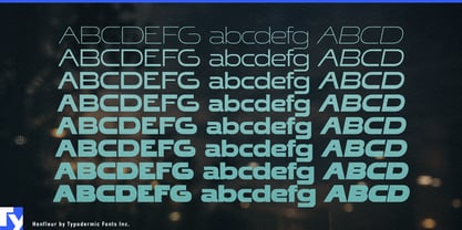
La familia tipográfica Honfleur fue diseñada por Ray Larabie, Chikako Larabie y publicada por Typodermic. Honfleur contiene 16 estilos y opciones de paquete familiar. Más información sobre esta familia

Sobre la familia


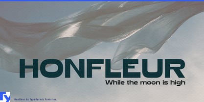
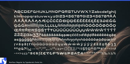
Honfleur makes a statement without raising its voice. Its exceptionally wide, geometric letterforms plant themselves firmly on the page, each stroke even and assured. Corners are softened, giving its modernist precision a touch of human warmth, while open counters and high crossbars invite light and air into every word. The result is a typeface that commands space with calm authority, now with the range to adapt from delicate to bold expression.

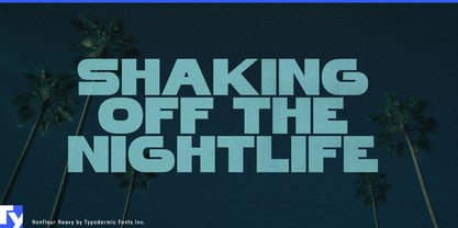
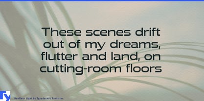
Inspired by a 1938 perfume poster, Honfleur carries a trace of old-world elegance without feeling bound to the past. Its expanded range of weights and matching italics allows it to move effortlessly between roles: light styles bring a refined, airy presence to editorial layouts, while heavier weights deliver confident impact for headlines, signage, and branding. From contemporary gallery announcements to boutique hotel identities, it maintains a composed, sophisticated voice across every application.

Honfleur excels in large-scale settings, posters, storefronts, packaging, and editorial spreads…where clarity and presence matter. Its generous width gives words room to breathe, even at a distance, while its balanced forms ensure legibility without sacrificing style. With extended Latin language support, it carries its poise across a wide range of languages, from French-inspired branding to modern international design.

Whether you’re shaping a visual identity, designing packaging with a cosmopolitan edge, or setting headlines that need presence without aggression, Honfleur offers a versatile system of styles to support your work…gracefully and on its own terms.

Diseñadores: Ray Larabie, Chikako Larabie

Fundición: Typodermic

MyFonts debut: May 12, 2010

Honfleur

Acerca de Typodermic

Welcome to Typodermic Fonts, a spirited type foundry rooted in Nagoya, Japan, started by the Canadian typeface designer, Raymond Larabie in 2001. Our library brims with 500+ diverse typefaces to fuel creativity in graphic design, advertising, web, and app development. As digital type pioneers, we adopted web fonts and app licensing early, consistently pushing the design envelope. With Canadian heart and Japanese precision, we're your global partners in extraordinary typography. Explore Typodermic Fonts—where creativity meets character.

Seguir leyendo

Leer menos
