Ir directamente al contenido
Ir al contenido principal

Kadonk

por Typodermic
Estilos individuales desde $69.95 USD
La familia tipográfica Kadonk fue diseñada por Ray Larabie y publicada por Typodermic. Kadonk contiene 1 estilos. Más información sobre esta familia

Sobre la familia


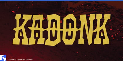
Some rough display fonts try to look dangerous. Kadonk is having too much fun for that. Its spikes, collisions, and warped proportions suggest improvised machinery, homemade armor, and things built from whatever was lying around. It looks less like a metal band and more like somebody found a toolbox, a pile of scrap, and a questionable plan.

The roughness is structural rather than cosmetic. Kadonk’s forms buckle, hook, widen, and occasionally lock together, so a word can feel assembled from mismatched pieces rather than simply distressed afterward. Hundreds of ligatures help resolve collisions between neighboring spikes; some pairs clear one another while others connect into larger shapes. Even in a perfectly clean solid color, the construction remains unstable and strange.

That makes Kadonk especially suited to build-and-battle graphics: robot combat kits, RC off-road vehicles, model machines, cardboard engineering projects, maker challenges, and science-fair contraptions. The same energy works for laser-tag arenas, obstacle courses, skate and BMX events, climbing challenges, and summer-camp competitions where team names, course zones, badges, and event titles need a little rebellion without drifting into horror or hard-rock seriousness.

Games and toys can push the idea further through junkyard racers, scrap-built robots, creature battlers, cartoon wastelands, goblin machinery, and arena games. Robotics clubs, bridge-building contests, egg-drop challenges, and engineering days benefit from the same approach; Kadonk makes the project name look like part of the contraption.

As an all-caps display face, Kadonk is strongest in compact bursts: machine names, team names, warnings, badges, faction marks, package titles, and event graphics. Its personality comes from roughness built into the letters themselves; not scratches printed on top, but an alphabet that looks as though it was bolted together under questionable supervision.

Diseñadores: Ray Larabie

Fundición: Typodermic

MyFonts debut: Nov 29, 2005

Kadonk

Acerca de Typodermic

Welcome to Typodermic Fonts, a spirited type foundry rooted in Nagoya, Japan, started by the Canadian typeface designer, Raymond Larabie in 2001. Our library brims with 500+ diverse typefaces to fuel creativity in graphic design, advertising, web, and app development. As digital type pioneers, we adopted web fonts and app licensing early, consistently pushing the design envelope. With Canadian heart and Japanese precision, we're your global partners in extraordinary typography. Explore Typodermic Fonts—where creativity meets character.

Seguir leyendo

Leer menos