Ir directamente al contenido
Ir al contenido principal

Katib Naskh

por Katib Type Foundry
Estilos individuales desde $129.00 USD
Familia completa de 3 fuentes: $399.00 USD
La familia tipográfica Katib Naskh fue diseñada por Fatih Babacan y publicada por Katib Type Foundry. Katib Naskh contiene 3 estilos y opciones de paquete familiar. Más información sobre esta familia

Katib Naskh Complete Family

3 fuentes

¡Mejor Precio!

Por Estilo:

$133.00 USD

Paquete de 3 estilos:

$399.00 USD

Sobre la familia


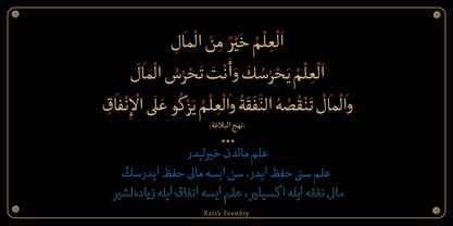
Kâtib Naskh is a classical nesih typeface for Arabic and Ottoman Turkish, with synchronized Latin.

It follows an old rule of the Ottoman scribes: never sacrifice clarity for form. The contrast is moderate, the letter stacking is restrained, and every shape is drawn to be read for pages, not admired for a line. Yet the character of the script stays intact, from the rhythm of the baseline to the classical proportions of each letter.

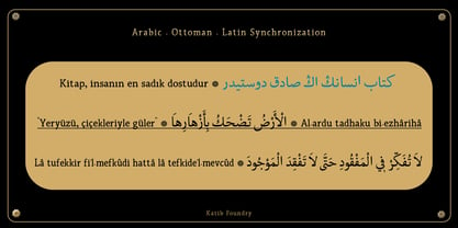
One font file carries three scripts. Arabic, Ottoman Turkish and Latin share the same rhythm and weight, so a bilingual title, a footnote in transliteration or an Ottoman quotation inside an English text all sit together naturally.

Tested like software. Crafted like calligraphy.

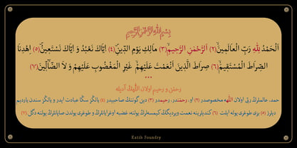
Before release, Kâtib Naskh was put through extensive shaping tests, using large word sets drawn from Qur'anic editions, Ottoman manuscripts and classical Arabic sources, alongside stress lists built to find the hardest letter combinations.

Every letter. Every harakah. Your color.

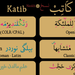
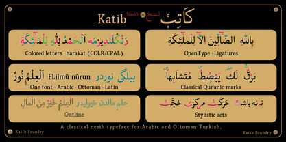
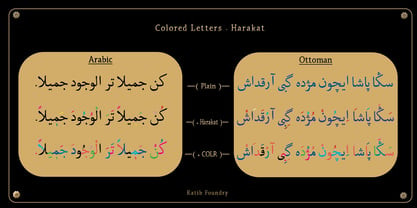
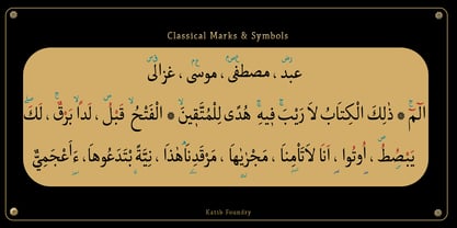
Letters and vocalization marks are built as separate color layers. Set the harakat in red, the way the old mushaf copyists did, or keep everything in one ink.

What's included:

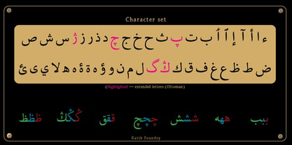
- Full Arabic and Ottoman Turkish alphabets, including پ چ ژ گ ڭ

- Complete harakat with precise mark positioning

- Classical Qur'anic marks, pause signs and honorific abbreviations

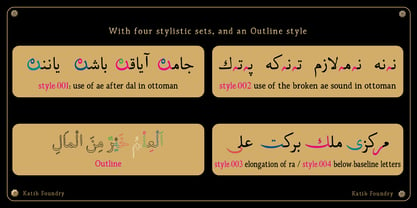
- Contextual ligatures and classical orthographic forms

- Three styles: Regular, Bold and Outline

Kâtib Naskh is designed by Fatih Babacan, who brings more than 2 decades of work in calligraphy, typography, font development and Ottoman Turkish teaching. It is the first release of Kâtib Type Foundry in Istanbul.

Diseñadores: Fatih Babacan

Fundición: Katib Type Foundry

MyFonts debut: Sep 30, 2026

Katib Naskh

Acerca de Katib Type Foundry

Kâtib Type Foundry is the type design imprint of Lumio Studio, located in Istanbul. The name, derived from the Ottoman Turkish word for "scribe," reflects the foundry's inspiration from the rich manuscript traditions of handwritten Qur’ans, Ottoman chancery documents, and classical nesih calligraphy. Kâtib's debut type family, Kâtib Naskh, seamlessly integrates Arabic, Ottoman Turkish, and complementary Latin characters into a single cohesive font. This design prioritizes clarity in calligraphic expression, maintaining the essence of traditional letterforms while ensuring readability in digital typography. Kâtib’s unique approach merges in-depth historical research with meticulous technical development, including rigorous testing across various Arabic and Ottoman Turkish texts, making it a standout choice for designers and typographers seeking authenticity and elegance in their work.

Seguir leyendo

Leer menos