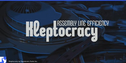
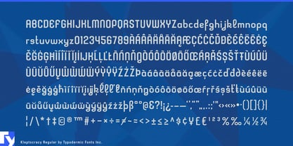
Late-1990s digital typography is easy to reduce to a few familiar signals: chrome, pixels, rave graphics, stretched techno lettering, and Y2K nostalgia. Kleptocracy comes from a stranger part of that period. Its condensed geometry, Art Deco compression, and unexpected cursive details create a digital postmodernism that already felt slightly out of time when it was made. That quality now gives designers an alternative to contemporary imitations of the era.
Kleptocracy is especially suited to cultural projects dealing with technology, media, and design history. Digital-art exhibitions, new-media festivals, design biennials, architecture shows, and programs about obsolete technology, early internet culture, surveillance, AI authorship, or digital archaeology can use it for exhibition titles, artist names, schedules, gallery graphics, catalogue covers, screening programs, and merchandise.
Music and nightlife provide another strong setting. Experimental pop, electronic labels, art rock, left-field dance music, listening bars, club series, and design-led festivals can use Kleptocracy for artist names, lineups, release graphics, event identities, venue graphics, and merchandise. It carries late-digital character without defaulting to the standard rave-font vocabulary.
Experimental fashion, eyewear, accessories, and period-referencing collections can use the same ambiguity for capsule names, runway graphics, fashion films, lookbooks, invitations, window displays, hangtags, and model names. Film, streaming, documentary, and game production can extend it into title cards, fictional companies, nightclub graphics, magazine covers, storefronts, and promotional material for dot-com dramas, financial thrillers, corporate satires, early-internet documentaries, and retrofuturist settings viewed through a 1990s lens.
Kleptocracy also suits investigative media dealing with corporate corruption, oligarchs, financial scandals, privatization, and institutional dysfunction. Its mixture of bureaucratic severity and mannered detail works well for titles, episode cards, data-graphic headings, and fictional corporations that need to look polished, technological, and faintly suspect.
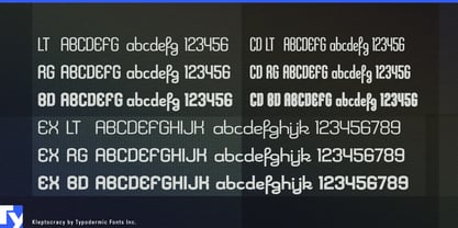
Across three widths, three weights, and italics, Kleptocracy turns its internal contradictions into a system. Compact capitals can look severe and industrial; looping lowercase forms interrupt that discipline; lighter expanded styles can become unexpectedly elegant. What once made Kleptocracy feel slightly obsolete now makes it useful as a genuine piece of late-1990s digital postmodernism.