Ir directamente al contenido
Ir al contenido principal

MARIAMNE

por Type Innovations
Estilos individuales desde $39.00 USD $27.30 USD
30% Off
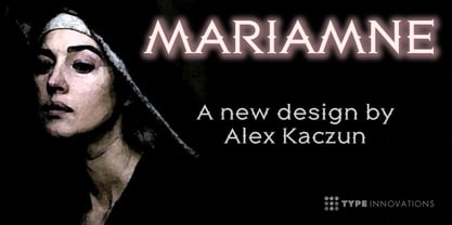
La familia tipográfica MARIAMNE fue diseñada por Alex Kaczun y publicada por Type Innovations. MARIAMNE contiene 1 estilos. Más información sobre esta familia

Sobre la familia


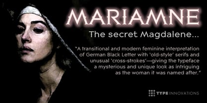
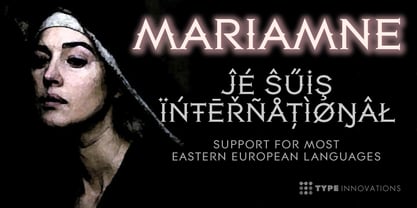
MARIAMNE is an original design by Alex Kaczun. It is an elegant, modern and traditional interpretation based on and modeled after his successful "Contax Pro" and "New Age Gothic" typeface series. As such, it has generous proportions with clean, crisp lines—ideally suited for easy reading and long lines of copy. Alex felt that the skeleton for "Contax" was perfectly suited to transform the design into a modern version of 'old-style', somewhat reminiscent of German Black Letter. Numerous modifications where made to the body proportions, stems and shapes. True 'old-style' serifs and unusual 'cross-strokes' where added for a touch of distinction. The 'cross-strokes' where added at exactly visual mid-point on the overall heights. This gives the typeface a romantic, female-like quality to the overall design. Strong, yet delicate. Visually stimulating in appearance and function. The result is a truly unique transitional and modern design. Unlike other typefaces, MARIAMNE incorporates uniform stems throughout the capitals, lower case and figures. This gives the design a uniform appearance in overall color and strength. There is a perfect visual balance between inter-letter spacing, stem weights and proportions. The accents are equally large, bold and command attention. This font includes a large 'Pro' character set, which supports most Central European and many Eastern European languages. As a result, the design is ideally suited for display copy as well as text composition. In the near future, Alex plans to expand the typeface series to include a light and heavy weight, along with true italics.

Diseñadores: Alex Kaczun

Fundición: Type Innovations

MyFonts debut: Jun 4, 2012

MARIAMNE

Acerca de Type Innovations

Alex Kaczun is an accomplished type designer and the founder of Type Innovations, specializing in the creation of high-quality typefaces and custom font solutions. With more than four decades of experience in typography, he has built a distinguished career focused on innovative type design, technical excellence, and the development of professional-grade fonts. Much of his career was spent at the premier type foundry Linotype-Hell, where he served as principal type designer. In this role, he contributed to major projects modernizing the Linotype Library, managed the development of The Adobe Font Library, and created Multiple Master fonts for Apple Computer’s QuickDraw technology—work that helped shape the early standards of digital typography. In 1980, Alex joined a pioneering group of entrepreneurs at Bitstream in Cambridge, Massachusetts, where he played a key role in developing the world’s first digital font library. This foundational experience deepened his expertise in both the artistic and technical aspects of typeface design. He later brought his specialized knowledge to Bozell Worldwide, the international advertising agency behind the iconic “Got Milk?” campaign, serving as type director. There he further refined his skills at the intersection of typography, graphic design, and production. In early 2003, Alex joined Bertelsmann’s Bookspan division (formerly Doubleday Books), where he applied his design expertise to create hundreds of book jacket designs and layouts for nearly 20 different book clubs. Most recently, Alex completed a two-year project designing a new family of online fonts for the rebranding of RBC—Royal Bank of Canada. Today, through Type Innovations, Alex continues to design original typefaces and offer professional font customization services. The foundry is dedicated to delivering the highest-quality type products, combining meticulous craftsmanship with technical precision to meet the needs of designers, brands, and creative professionals.

Seguir leyendo

Leer menos