

Ir directamente al contenido
Ir al contenido principal

Milibus

por Typodermic
Estilos individuales desde $69.95 USD
Familia completa de 8 fuentes: $109.95 USD
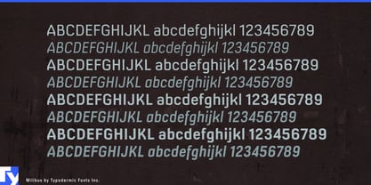
La familia tipográfica Milibus fue diseñada por Ray Larabie y publicada por Typodermic. Milibus contiene 8 estilos y opciones de paquete familiar. Más información sobre esta familia

Sobre la familia


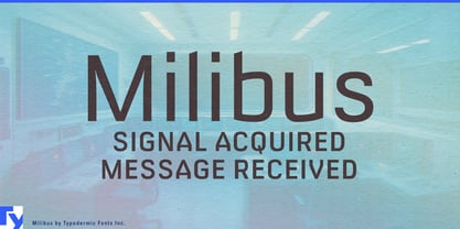
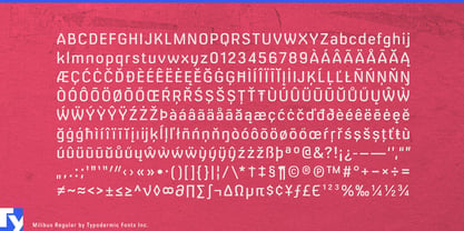
Real technology often needs typography that looks engineered without impersonating an industrial standard or turning every product into a science-fiction prop. Milibus is a technical sans-serif whose modifications are visible enough to give a brand proprietary character, yet restrained enough for headings, labels and short explanatory copy.

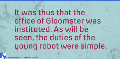
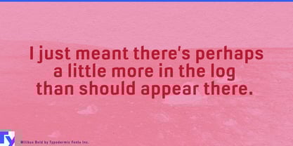
Milibus concentrates its distinctive treatment in diagonal forms. Flattened sides open the counter of the A and replace conventional points in the V, W, X, Y and K with measured cuts. The alphabet does not become dramatically narrower; instead, it looks as though its geometry has undergone an optimization pass. Familiar curves and lowercase forms keep sentences readable, while the clipped diagonals give product names and model numbers a recognizable signature.

That balance suits companies connecting physical equipment with software and documentation. Industrial robots, machine-vision cameras, automated warehouse vehicles, inspection systems and factory sensors can carry Milibus from equipment badges and product-series names into controller headings, specification sheets, training videos and trade-show displays.

Its engineered efficiency also suits battery-storage systems, power inverters, fleet-charging equipment, heat pumps and building-energy platforms. Laboratory analyzers, optical scanners, metrology systems, surveying drones and satellite payloads extend the same visual idea into precision instruments and remote-sensing technology. Milibus can identify equipment families, organize diagrams and structure technical presentations, while a neutral companion face handles tiny readings and extended text.

Milibus also suits plausible designed futures: research-station interfaces, orbital-logistics games, fictional engineering firms, science-documentary titles and museum exhibitions. It suggests technology backed by procedures, departments and a very particular equipment catalogue.

Diseñadores: Ray Larabie

Fundición: Typodermic

MyFonts debut: Aug 9, 2006

Milibus

Acerca de Typodermic

Welcome to Typodermic Fonts, a spirited type foundry rooted in Nagoya, Japan, started by the Canadian typeface designer, Raymond Larabie in 2001. Our library brims with 500+ diverse typefaces to fuel creativity in graphic design, advertising, web, and app development. As digital type pioneers, we adopted web fonts and app licensing early, consistently pushing the design envelope. With Canadian heart and Japanese precision, we're your global partners in extraordinary typography. Explore Typodermic Fonts—where creativity meets character.

Seguir leyendo

Leer menos
