Ir directamente al contenido
Ir al contenido principal

Nasalization™

por Typodermic
Estilos individuales desde $69.95 USD
Familia completa de 12 fuentes: $169.95 USD
La familia tipográfica Nasalization fue diseñada por Ray Larabie y publicada por Typodermic. Nasalization contiene 12 estilos y opciones de paquete familiar. Más información sobre esta familia

Sobre la familia


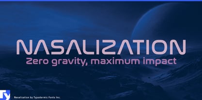
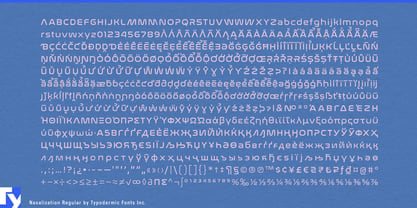
Putting a name on a high-performance object is harder than it looks. A bicycle frame, ski, helmet, racquet, paddle or spacecraft may be shaped around speed, precision and engineered materials, but its model name still has to look as though it belongs there. An ordinary geometric sans can feel like an afterthought; excessively futuristic lettering can turn serious equipment into a movie prop. Nasalization occupies the useful territory between those extremes.

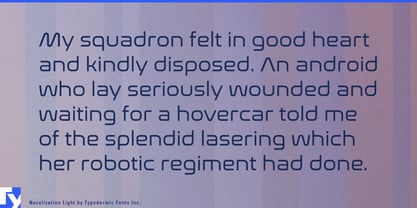
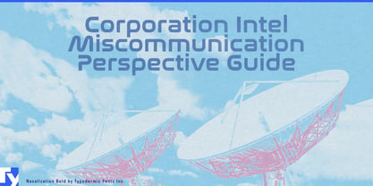
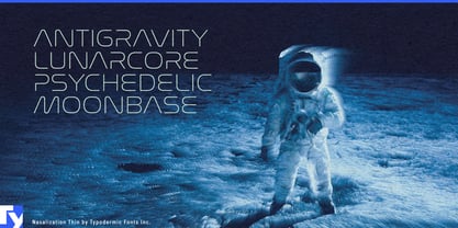
Its broad, low-contrast geometry gives product names and model designations a distinctly engineered appearance while keeping the letterforms recognizable. The expanded proportions work especially well across long physical surfaces: bicycle down tubes, skis and snowboards, fitness machines, protective equipment and other sporting goods. Heavier weights can turn a short model name into a major part of the product graphics, while lighter weights handle series names, specifications and secondary markings within the same visual system.

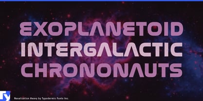
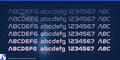
That affinity with engineered objects has a genuine source. Nasalization began in 1997 as a modular all-caps design inspired by the geometry of NASA’s 1975 “worm” logo, extending the logic of its four letters into a complete alphabet. The family later grew to include lowercase, six weights with italics, Greek and Cyrillic support, contextual forms for M and W, and alternatives such as a cross-barred A. Its connection with spaceflight eventually came full circle through use associated with NASA’s Perseverance Mars mission.

Aerospace, satellite technology, space robotics and scientific equipment therefore feel as natural to Nasalization as performance sports. It can carry spacecraft names, launch-system identities, equipment markings, exhibition graphics and large technical headings without resorting to fractured or gimmicky sci-fi forms. Planetariums, astronomy exhibitions, science centres and model-rocket products can draw on the same visual language. Across all of these uses, Nasalization is particularly good at one job: making the name of an engineered thing look like part of the engineering.

Diseñadores: Ray Larabie

Fundición: Typodermic

Fundición original: Larabie

MyFonts debut: Oct 18, 2004

Nasalization™ is a trademark of Typodermic.

Acerca de Typodermic

Welcome to Typodermic Fonts, a spirited type foundry rooted in Nagoya, Japan, started by the Canadian typeface designer, Raymond Larabie in 2001. Our library brims with 500+ diverse typefaces to fuel creativity in graphic design, advertising, web, and app development. As digital type pioneers, we adopted web fonts and app licensing early, consistently pushing the design envelope. With Canadian heart and Japanese precision, we're your global partners in extraordinary typography. Explore Typodermic Fonts—where creativity meets character.

Seguir leyendo

Leer menos
