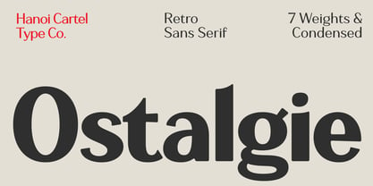
Ostalgie: For the nostalgia of a bygone era
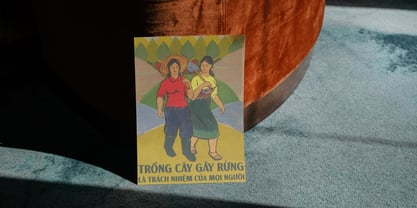
Growing up in Vietnam, my daily commute was an education in a very specific kind of graphic design. We are a country with a complex, vibrant history, and the remnants of our political past are painted directly onto our walls. I am talking about the propaganda posters. If you have ever walked the streets of Hanoi, you know exactly what I mean. You see these massive, hand-painted murals and banners calling for unity, celebrating the working class, or marking national holidays. They are used to be everywhere, woven into the fabric of the city alongside the buzzing motorbikes and the street food vendors.
Since I became a designer, I was naturally drawn to the typography on these posters. There is a distinct "Eastern Bloc" aesthetic to them. The letters are commanding, loud, and engineered for maximum impact. They had to be; their entire purpose was to broadcast a message or a single narrative to the masses from a great distance. But because they were often painted by local artisans using flat brushes or carved into concrete, they possessed an inherent imperfection. They weren't drawn with clinical, mathematical precision on a computer. The stems flared out slightly where the brush met the canvas. The curves had a slight wobble, a human tension. They were brutalist, yes, but they also had some kind of soul in there.
This aesthetic isn't just native to Vietnam. You see the exact same typographic DNA in the archives of the Soviet Union, across Eastern Europe, and notably in the former German Democratic Republic (East Germany). In Germany, there is a cultural term called Ostalgie—a blend of Ost (East) and Nostalgie (Nostalgia). It describes a nostalgic longing for the everyday culture, the aesthetics, and the objects of the GDR era. Of course I am not cheering for the coming back of the GDR or their infamous horrible security branch, but when I started sketching the first few letters of this new font, that word perfectly captured the vibe I was chasing. I wasn't trying to make a political statement; I was chasing that specific, utilitarian, vintage feeling. I wanted to capture the visual language of the olden East and hope to find a place for it in modern creatives.
The Anatomy of Ostalgie
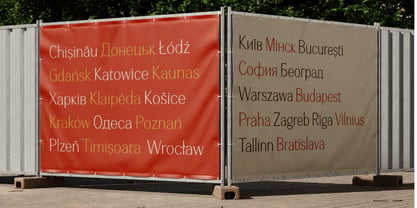
When I sat down to actually build Ostalgie, the challenge was figuring out how to make a font that looks like a vintage propaganda poster but functions like a modern, premium typeface. It is a delicate balancing act. If you make it too distressed or too wonky, it becomes a novelty font that people only use once for a joke. If you make it too clean, it loses the magic that inspired it in the first place.
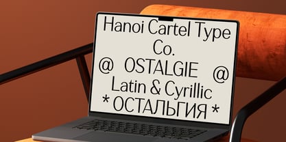
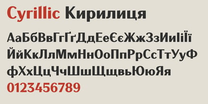
Working on Ostalgie, 99 percent of the time, I feel like an imposter who dream too big, trying to walk around in these huge shoes that I was struggle to fill. The words of Jonathan Hoefler keep ringing in the back of my ears: "You’ll learn more by making three small typefaces than one big one, so start with something manageable." A typeface, to me, is always an art project and it will never be perfected or finished, but here I am ready to abandon it. And last but not least, you cannot create a typeface called "Ostalgie" without paying proper respect to the Cyrillic alphabet, so you will get those as well! God speed!