Ir directamente al contenido
Ir al contenido principal

Otoboke

por Typodermic
Estilos individuales desde $69.95 USD
La familia tipográfica Otoboke fue diseñada por Ray Larabie y publicada por Typodermic. Otoboke contiene 1 estilos. Más información sobre esta familia

Sobre la familia


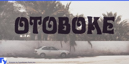
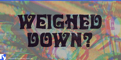
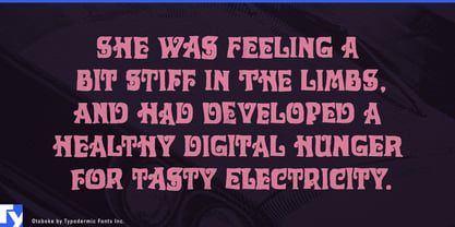
Otoboke is for product lines that need to look individually hand-lettered without hand-lettering every item.

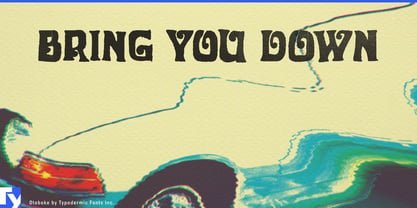
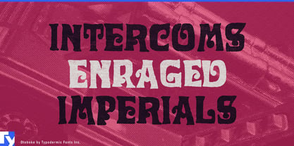
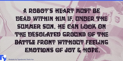
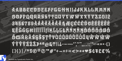
Its all-caps forms are swollen, lopsided and deliberately unstable, with irregular printed edges and alternate letterforms that keep repeated characters from falling into obvious digital repetition. That makes it especially useful for ranges built around many names, flavors, characters or releases that should feel related without looking mechanically identical.

Confectionery and personality-driven snacks are a natural fit. Sour gummies, chewy candy, novelty chocolate, spicy chips and limited-edition flavor ranges often need dozens of short product names under one recognizable identity. Otoboke gives those names enough variation to feel individually drawn while maintaining a consistent visual system across wrappers, bags, boxes and point-of-sale graphics.

Collectible toys and character brands benefit from the same approach. Blind-box creatures, weird-cute plush, vinyl monsters, capsule toys and expandable character series need lettering for line names, individual characters, rarity tiers and successive releases. Otoboke can give each name a little visual mutation while a quieter companion handles warnings, series numbers and product information.

Its irregular construction also suits animated comedy, monster stories, absurdist games and family tabletop titles where the cast or vocabulary is intentionally strange. Series titles, character names, expansion names and merchandise can share one unruly lettering language without every application becoming a separate custom-lettering job.

Otoboke’s warped mid-century ancestry gives it a trace of psychedelic display type, making it useful for blacklight mini-golf, retro arcades, immersive funhouses and other entertainment spaces that can support visual excess. It also works for kidult products and revived character properties aiming for peculiar toy-aisle nostalgia rather than strict period authenticity.

Otoboke is not built for neutral information or long passages. Its strength is repetition without sameness: a display system for many names, characters and flavors that belong together without ever looking completely identical.

Diseñadores: Ray Larabie

Fundición: Typodermic

Fundición original: Typodermic

MyFonts debut: Jul 8, 2008

Otoboke

Acerca de Typodermic

Welcome to Typodermic Fonts, a spirited type foundry rooted in Nagoya, Japan, started by the Canadian typeface designer, Raymond Larabie in 2001. Our library brims with 500+ diverse typefaces to fuel creativity in graphic design, advertising, web, and app development. As digital type pioneers, we adopted web fonts and app licensing early, consistently pushing the design envelope. With Canadian heart and Japanese precision, we're your global partners in extraordinary typography. Explore Typodermic Fonts—where creativity meets character.

Seguir leyendo

Leer menos