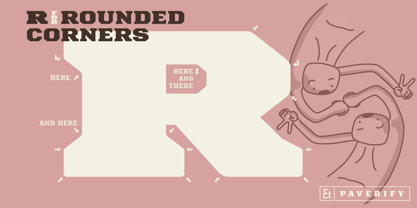
Paverify is an all-caps geometric slab serif display face inspired by a particular pavement tile component which is evoking a blocky “I” letter. All other characters were interpreted based on its look and drawn accordingly.
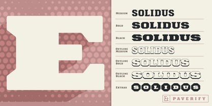
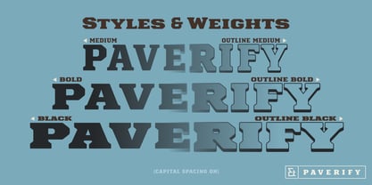
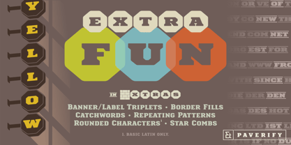
There are three uppercase Roman fonts in different weights and widths substantially. With the additional versions, type family consisting of 7 fonts in total.
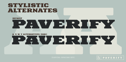
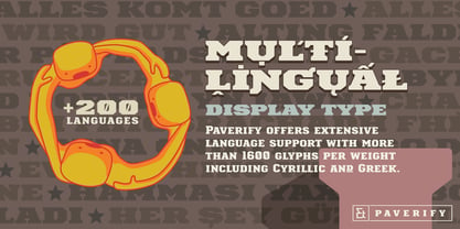
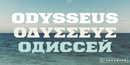
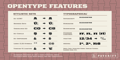
Over 220 Latin, Cyrillic and Greek script languages supported. Each font contains an extensive multilingual support with more than 1600 glyphs and OpenType features, including number forms, fractions, and stylistic alternate sets those provide different looks by the typographic preferences. For the lowercase letters there are small caps variants, i.e., shorter caps. These also have identical glyphs and matching marks to enable “Small Capitals From Capitals” feature.
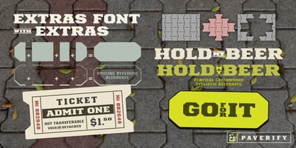
Narrower Medium and Bold styles was produced to accompany the Black first design. Paverify comes with an ornaments font named as “Extras”, which contains geometric graphical elements, i.e., paver stone patterns, banner/sticker background sets, star comps and a collection of catchwords to simplify creating feature rich layouts.
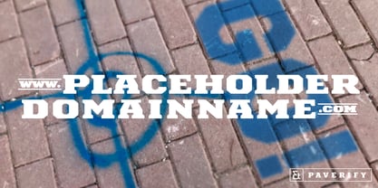
As is known as interlocking paver in certain regions — a rectangular shape with the distinctive diagonal tabs — transcribing the simplest letter to draw into the whole alphabet was a challenging task. Not only it was the single thing that can be used as a source, considering its thick form in roughly 1.2:1 proportions compared to the sophistication of letterforms was the challenge. Starting point was keeping design consistent while both avoiding and preserving a particular appearance to achieve a similar texture, basically a repeating pattern on the streets.
In contrary of a traditional approach, Paverify tend to have more contrast than the other slab serifs which helps to reduce massive stem weight of the source form. This look contributes to its hand painted sign effect achieved in a certain degree, which may otherwise impractical to transform because the source material is an inorganic, static form by definition.
Tight and even spacing of the pavement tiles was inspirational for the kerning balance of the letters. Although the lighter weights have more space between the letter pairs, black weight adjusted as to be close to each other as the original grid. Tight spacing can be ignored by using Capital Spacing OpenType feature for the Outline versions as layer fonts. In one stroke, this gives an extra space between the letters to avoid diagonal armed letter terminals overlap.
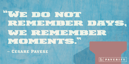
Black typographic colour and texture gives a sturdy appearance to the lines, it is useful for the projects where a robust display faces preferred for the titling, strong headlines, letter stacks, dropcaps, initials, short names on materials such as advertisements, book covers, posters, logotypes, wordmarks, package designs, and more in print or digital. Paverify can be paired as a complimentary face in a combination with broader type systems, where vintage look compositions and woodcut style fusions requiring an extra stunning texture.