


Postman
por Juan I. Siwak


Sobre la familia
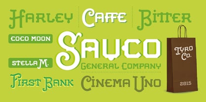
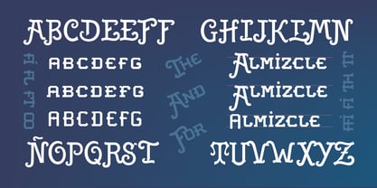
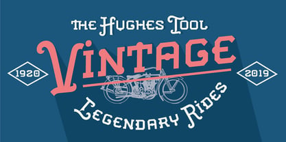
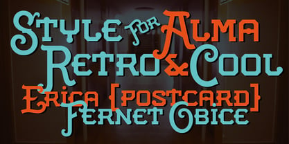
Postman is a typeface inspired by old documents, banknotes and leading product brands. It has cursive and elegant capital letters and its lowercase letters are actually small caps of geometric shapes as if they were made of metal and nailed with bolts. It is ideal for classic products that consider nobility and tradition among their virtues. It evokes classic products that lasted over time. Includes OpenType features, like ligatures, alternates, and more.
Acerca de Juan I. Siwak
Juan Ignacio Siwak is a graphic designer, and started working before he finished (never completed) his studies. He has a comprehensive and eclectic formation in music, philosophy, psychology and graphic design. His interest in typography love comes from his childhood with his father, who is a journalist, and from the covers of rock albums. Since getting some awards in this field, he decided to complete some of his work and start new ones. He works independently as a designer and specializes in editorial design, identity, and also in computer graphics and medical illustrations.
Seguir leyendo
Leer menos
- Al seleccionar una opción, se actualiza toda la página.