Ir directamente al contenido
Ir al contenido principal

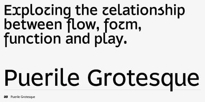
Puerile Grotesque

por Applied Systems Design Studio
Estilos individuales desde $50.00 USD
Familia completa de 9 fuentes: $270.00 USD
La familia tipográfica Puerile Grotesque fue diseñada por Alister Shapley y publicada por Applied Systems Design Studio. Puerile Grotesque contiene 9 estilos y opciones de paquete familiar. Más información sobre esta familia

Sobre la familia


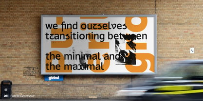
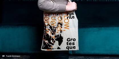
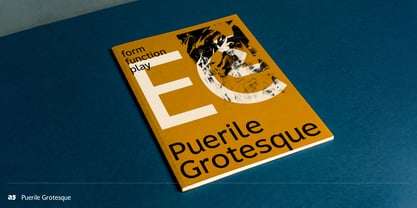
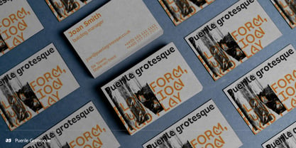
Puerile Grotesque explores the relationship between form, function and play, combining the rational foundations of modernist typography with a more playful approach to letterform construction.

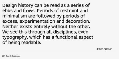
Built around controlled proportions and considered strokes, Puerile Grotesque draws on the functional characteristics of the grotesque while questioning the idea that letterforms need to remain fixed. Typography has always moved between restraint and expression. Periods of minimalism are followed by periods of experimentation, decoration and excess, with each influencing what comes next. Puerile Grotesque sits within this tension, exploring what happens when a functional typographic system is given room to play.

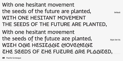
Play does not mean abandoning function. Instead, it offers a way to explore new forms, introduce humour and create variation within an established system. OpenType features, stylistic sets and contextual alternates allow designers to move between familiar and unfamiliar letterforms, choosing forms according to context, tone and application.

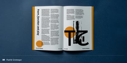
Familiarity is central to the Puerile family. We rarely question the structures of the letters we use every day because repeated exposure has taught us what feels correct. The relationship with Puerile Display takes this investigation further. Where the display style explores ornament, decoration and expressive forms, Puerile Grotesque approaches the same questions from a more restrained position. The two styles are deliberately distinct, but their shared approach to structure, variation and play creates a cohesive family.

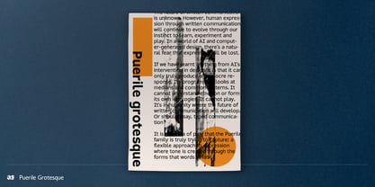
Puerile Grotesque is ultimately about the evolution of familiar forms. As written communication continues to develop alongside new technologies and changing visual cultures, the boundaries of the alphabet remain open to interpretation. The Puerile family embraces this uncertainty, using play to question convention and explore how familiar forms might evolve.

Diseñadores: Alister Shapley

Fundición: Applied Systems Design Studio

MyFonts debut: Oct 12, 2026

Puerile Grotesque

Acerca de Applied Systems Design Studio

Applied Systems is a type-led design studio and independent foundry dedicated to crafting meaningful, concept-driven typefaces. Our designs seamlessly blend historic and heritage letterforms with contemporary requirements, curating a diverse range of typographic influences into innovative creations. Each release is grounded in thorough research and storytelling, often inspired by social, political, or historical contexts, enabling every typeface to convey deeper messages beyond mere words. Ideal for designers, brands, and industries seeking unique typographic solutions, our work stands out for its thoughtful approach and distinctive style.

Seguir leyendo

Leer menos