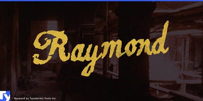
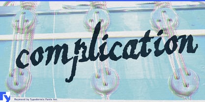
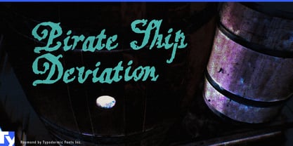
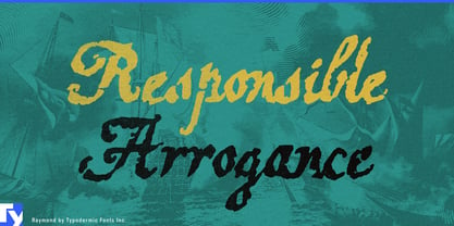
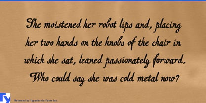
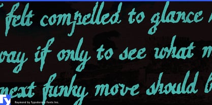
Raymond began with an ornamental script found in an old metal-type catalog and ended after an unreasonable amount of digital mistreatment. The source was autotraced, distorted, and developed into a practical connected typeface. That working version was rasterized, subjected to layer after layer of Photoshop torture, retraced, cleaned by hand, and overlaid on the functional font. The process preserved the old design’s elaborate calligraphic structure while giving each contour the battered surface of a badly printed, badly stored, repeatedly copied artifact.
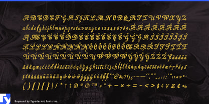
Looping capitals, pronounced stroke contrast, tall ascenders, and deep descenders carry the ceremony of historical commercial script. Rough edges, broken strokes, and patches of visual noise interfere with that formality. Raymond sits apart from tidy sign-painter nostalgia and ordinary distressed handwriting; it is formal lettering with doubtful provenance.
That contradiction works especially well on food and drink packaging. Raymond can lead labels for herbal bitters, amaro, dark rum, rye whiskey, vermouth, barrel-aged beer, and spiced cordials. Its rough ornament also suits fermented hot sauce, smoked salt, black garlic, preserves, molasses, dark chocolate, and old-fashioned confectionery. On a bottle label, neck tag, batch seal, chocolate wrapper, sauce carton, or tavern menu, the product name can appear inherited, illicit, or recovered from an archive whose filing system left much to be desired.
The same uneasy authority suits patent-medicine bottles, cigar boxes, travelling-magician handbills, dubious certificates, ghost-tour placards, séance invitations, folk-horror titles, and prop documents for fabricated histories. In music graphics, it fits psych-folk, murder-ballad collections, gothic Americana, garage blues, folk punk, and occult rock. The old songbook flourish survives, while the distressed surface keeps the result away from polite nostalgia.
Raymond makes its strongest impression in a few words. Product names, titles, chapter openings, oversized initials, and short poster lines give the intricate capitals and damaged contours enough room to work. It was built as a practical font beneath all that damage, but its real task is atmosphere rather than sustained reading.